
vitexeon
The tab bar is in one line like the browser (shortening the length of the tab name, rather than scrolling to the right)
Hello,
We have completed the migration. The next version should be able to support more UI tweaking. The beta should be out soon, let us know what you think but don't forget that we might have changed some default, let me know if anything goes wrong. This was a huge project for us.
Regards
@David Hervieux
Will David be able to fix the "Fit to title" function in the next release, or add an option (checkbox) -> "Fit to title without cropping name" to the "Tabs" section of the RDM settings ?
The tab bar is in one line like the browser (shortening the length of the tab name, rather than scrolling to the right)
Hello David. We tested the "Shrink tabs to fit" feature in RDM version 2026.3.13.0, and it works great !!
But the "Fit to title" function turned out to be broken.
Let me explain: previously in RDM version 2025 and early 2026 builds if a LONG entry name was used (for an RDP session, website, or any item, really), the tab would display the FULL name upon launch (I’ve attached a screenshot). Even in multi-line tab mode, the tabs were wide enough to show the full names. This is how most users name their entries (especially those who want clear, immediate classification, where the name includes various parameters and details); it makes things visually convenient.
Now, however, the "Fit to title" mode starts TRUNCATING long names in the middle and inserting an ellipsis (...) on the tab, which is VERY INCONVENIENT.
This is what the full name of the entry in the navigation tree looks like.

This is how the name gets cut off in the tab (even though "Fit to title" mode is selected), and it’s very inconvenient.

This is how it used to be in this mode for instance, when you wanted to use a few tabs or relied on multi-line wrapping.

Could this mode be fixed to display the full entry name?
Or perhaps a checkbox could be added to the tab settings labeled "Fit to title without cropping name"? (Ideally, this mode should work whether tabs wrap to multiple lines or are arranged in a single line that extends into a horizontal scrollbar <>).
PS: We also noticed an error in the tooltip that appears when hovering over a tab: the record name gets truncated there as well, but differently (the "..." ellipsis isn't inserted). The name is cut off from the end, and the truncation varies depending on the length of the name on different tabs.
The record name was cut off in the tooltip.

The tab bar is in one line like the browser (shortening the length of the tab name, rather than scrolling to the right)
Great news, David. What link can I use to download this beta version? And where can I read the instructions on how to enable the new tab layout functionality, similar to the browser?
The tab bar is in one line like the browser (shortening the length of the tab name, rather than scrolling to the right)
Hello,
Nothing new. It's more of a long-term goal, but we are in the process of modernizing RDM, and we should have more control over the UI components:
https://blog.devolutions.net/2025/01/modernizing-the-codebase-of-rdm-a-journey-from-2008-to-2024/
In 2 or 3 years, I hope that we will no longer have excuses for using third-party UI components. :)
@David Hervieux
Have a good and great year, David. Tell me, will there be tab scrolling like in browsers in 2026 ?
The "Save and Open" button is in a bad location
I couldn't find this new option (( Can you attach a screenshot of where to look?
The tab bar is in one line like the browser (shortening the length of the tab name, rather than scrolling to the right)
Good day, dear David. Could you tell me how the function of reducing the width of tabs works, similar to browsers?
The "Save and Open" button is in a bad location
The "Save and Open" button is in a bad location. For decades, Microsoft has been teaching us that in the lower right corner, there are only 2 buttons: confirm the action (save) or cancel the action. And when a 3rd button appears next to them, our brains now EXPLODE, we add a LOT of new records first to the RDM database and only then test or open them (the function to open a newly created card is useful, but its implementation with a 3rd button next to the main ones is terrible). Our work process has slowed down catastrophically, we constantly miss, and instead of saving the card, we open a session. HIDE this button PLEASE to another place (1. you can move it to the right of the search field in the card. 2. you can make a triangle on the MAIN SAVE button, which allows you to select the purpose of this button (we have seen this in some programs, when you can reassign the button by selecting an action on it) 3. Well, at least move it to the main OPTIONS SETTINGS RDM, so that the button "Save and Open" can be disabled, visually removed).
The tab bar is in one line like the browser (shortening the length of the tab name, rather than scrolling to the right)
I've seen exactly the same feature request here:
https://supportcenter.devexpress.com/ticket/details/t102339/documentmanager-tabbedview-implement-the-capability-to-auto-resize-tab-page-headers
Good afternoon, David. Can you tell me how things are going with the third-party component? Will your partners be able to develop functionality for shortening tabs in length (as in browsers auto resize tab page) ? Should we expect such a great feature in the upcoming RDM releases?
The tab bar is in one line like the browser (shortening the length of the tab name, rather than scrolling to the right)
Hello,
This is something really interesting. I did a quick search, and the third party that we use does not support that. I will try to submit a feature request to them.
Regards
We will be looking forward to this very useful feature, David (as we can see, other users also have an interest and request for its appearance). As I understand it, by a third party you mean the developer of the visual components that are used in RDM, it would be great if they implemented in the tab bar such a property to reduce their length as in browsers (I think it's not so difficult) and will bring new very useful functionality in other products too
Ps: if it's not difficult, David, please tell us in the future how they reacted to this idea, and is it worth waiting for such a useful panel feature?
The tab bar is in one line like the browser (shortening the length of the tab name, rather than scrolling to the right)
Is it possible to add such a mode for the tab bar so that it works in one line, like a browser (so that when it overflows, the tab width decreases). Now that the "online tab bar" option is selected, the tab bar continues to increase to the right (scroll arrows appear), add a mode in which you can reduce the tab length, as in any browser when there are many tabs (scroll arrows are slightly longer). useless solution, at least in our tasks) PS: The tab group panel mode is not suitable for us, since the purpose of the tab is precisely in its name, and in our tasks they cannot be grouped, it is better to shorten the length of the tab. I think many people would support our idea if you created a 3rd tab bar mode similar to yours.
PS: Tab group bar mode is not suitable for us, since the purpose of the tab is precisely in its name, and in our tasks they cannot be grouped, it is better to shorten the length of the tab. I think many people would support our idea if you created a 3rd tab bar mode like the browser.
VERY small folder icons have become
Thank you very much. And why did you decide to enter the icon in the folder picture by default? (and not vice versa, so that whoever needs it would include the entry through the option)... After all, even on Full HD monitors, when the icon is placed in a folder, everything is very small, and even more so on 4k... What is the scenario that exactly the icon entry should be by default?
How to remove SCROLLING in the right mouse button menu on any of the tree elements ?
And are there any guidelines when they fix it so that you make changes to the new RDM release as well?
How to remove SCROLLING in the right mouse button menu on any of the tree elements ?
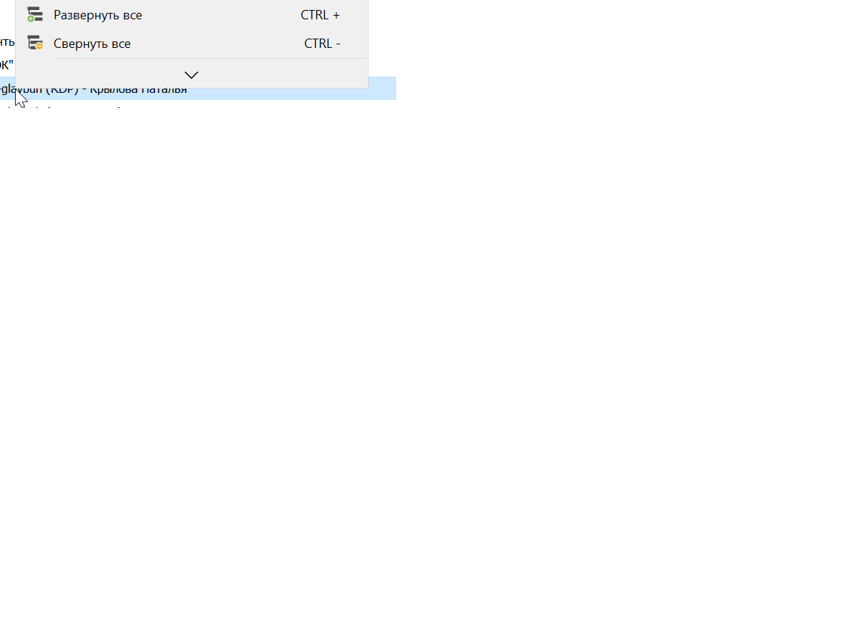
How to remove SCROLLING in the right mouse button menu on any of the tree elements ?
Alas, the problem returned on the release of 2023.3.24.0, scrolling appeared again, and in exactly the same places as in the original screenshots of this topic ((( just click the right button on any element with a 4k monitor, and the right menu again contains the bottom scrolling...
And now the last word "Properties ..." is completely closed by the scroll arrow (in the first long-standing problem in the screenshots, the word was closed in half, now the scroll arrow disappears completely there) By the way, now the shape of the scrolling arrow is different, not the same as the first time
PS:
Before this release, for many updates, there was no problem
Extend the HEIGHT of the Description text box in the Description Section of any object
Very cool, thank you very much
VERY small folder icons have become
Good day David, for many releases the problem of this post has been fixed. But again, starting with the release of 2023.2.18.0, the problem of small icons inscribed inside the folder icon has returned again... Again, alas, nothing is visible if a non-standard icon is selected on the folder (it fits inside again and it is not visible again ((( is it possible to provide any option in the interface settings (let's say a check box that will be responsible for this behavior, for example ("enter / not write a non-standard icon in the folder" name option)

On a 4k monitor, it is generally impossible to see what is inside the folder icon
PS: Your dedicated tester
winbox does not open "inside (on account)" such an opportunity is gone, only "outside"
I tried. Everything works great. Thank you very much, this is a very useful and cool RDM feature for open applications in internal tabs
Extend the HEIGHT of the Description text box in the Description Section of any object
Where can I monitor the progress of the ticket implementation ?
winbox does not open "inside (on account)" such an opportunity is gone, only "outside"
Thank you very much, we are waiting for the new version
winbox does not open "inside (on account)" such an opportunity is gone, only "outside"
As you asked. updated winbox to latest version 3.38 and ran it fine from cmd prompt without fail. I'm attaching a screenshot. Works great.
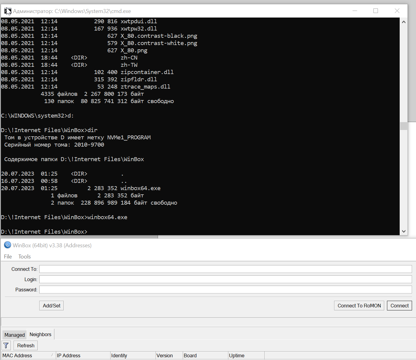
winbox does not open "inside (on account)" such an opportunity is gone, only "outside"
I’m sorry if I hurt something, it doesn’t always work correctly (I just indicated that I wanted the WinBox 6.1 version never arose, and maybe we are talking about different things, and I didn’t describe the problem correctly).
Therefore, let me ask why WinBox version 3.37 or 3.38 is installed (with a difference of half a year between them) and RDM 2023.1.20.0 perfectly opens the WinBox application in tabs, RDM version 2023.2.12.0 and higher stopped doing this (the function simply became blocked) while these Microtik engineers did not carry any changes in WinBox ...
PS
David, maybe I'm an evil tester)) but I'm a very dedicated user of your product from the first versions, and I hope I always correctly point out RDM BUGS that only allow it to get better (remember only that annoying mistake when winbox passwords disappeared in the DBMS, and we are together figured out the problem, and I think this is a very critical bug for RDM and very specific)
PSS
by the way, why doesn't the RDM community contact the WinBox developers for official support, we have quite a lot of Microtik equipment, maybe they don't leave to figure out the problem...
PSSS
As soon as support for WinBox appeared in RDM, maybe since the end of 2021 everything has always worked fine... By the way, just like the WinSCP application works, it always opens just as well in the inside. As a result, you will be able to use RDM at your own risk Unlock the ability to open WinBox in RDM subtabs ?? (honestly always perfectly opened inside)
Extend the HEIGHT of the Description text box in the Description Section of any object
Extend the HEIGHT of the Description text box in the Description Section of any object

For some reason, you reduced the height of this field from 6 lines to 4, and now scrolling is constantly hanging there, in any object.
Now FULL HD monitors are already widely used and 4k monitors are gradually coming, expand this field in ALL objects to at least 10-12 lines (and this is done on other text fields of descriptions, let's say Free field No. 5)

Well, or give the opportunity to edit the HEIGHT - NUMBER of lines in the DESCRIPTION field of the description section (with the slider right in the window) or a number somewhere in the settings. 4 lines is VERY SMALL for a DESCRIPTION
winbox does not open "inside (on account)" such an opportunity is gone, only "outside"
Hello Patrick,
Your engineering department is VERY confusing, WinBox programs never meet version 6.1 as well as versions 5.xx-4.xx, the maximum version of WinBox to use the program is 3.38 !!! what is the possibility of a screenshot from the developer's site from today
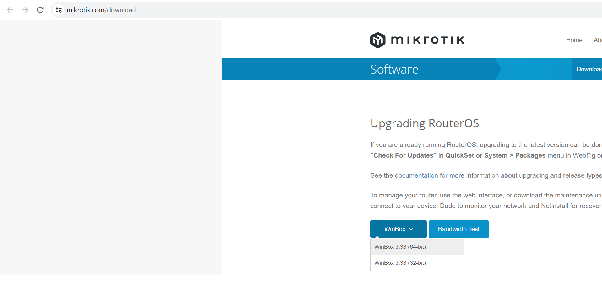
Don't let the engineering department confuse the firmware version of the Microtik hardware called RouterOS with the WINDOWS settings programming software called WinBox (it's written in a low-level language and has only standard Windows window management features)
And also, I haven’t updated the WinBox version since 2022 and I have version 3.37 and the problems started precisely in your new RDM 2023.2.12.0 release in release 2023.1.20.0 everything works fine, and even if I install the latest version of WinBox 3.38 !!!
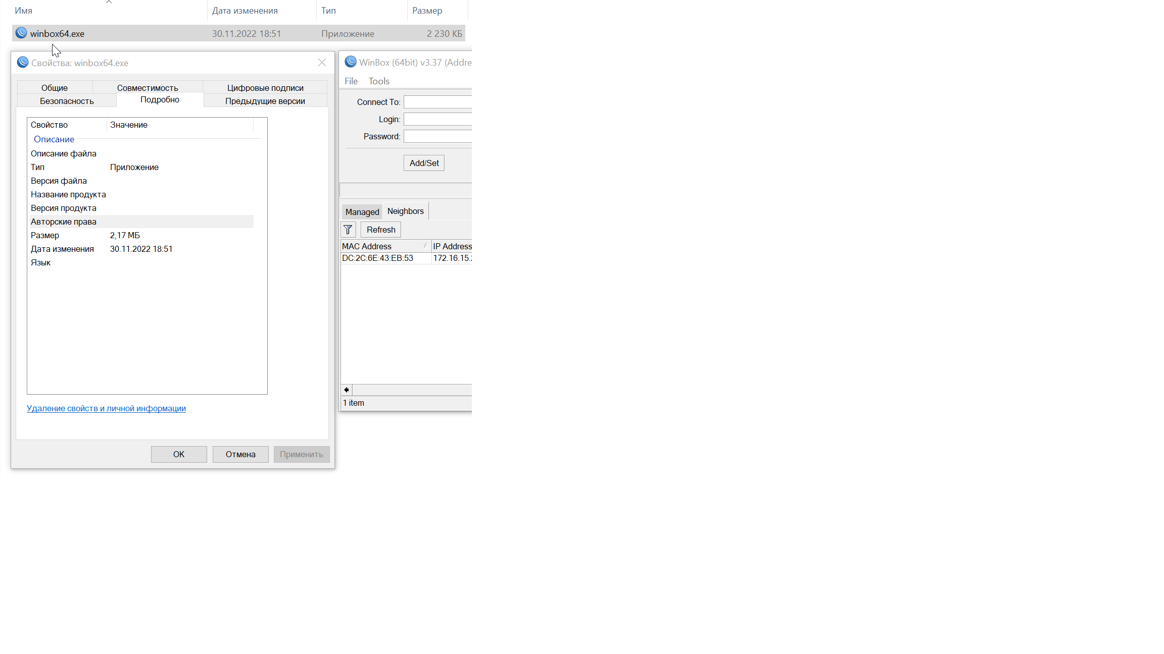
I ask you to look into the problem and return the ability to work to the WinBox program in tabs, since this is exactly the problem on the side of the RDM code !!! I think it's just a mistake that they just blocked this function from opening in tabs ... alas, this happens often with RDM engineers (if you look at the error posts found, I always turned out to be right )))
PS
I look forward to a speedy fix and the return of the functionality to open the WinBox program in internal tabs RDM
winbox does not open "inside (on account)" such an opportunity is gone, only "outside"
winbox does not open "inside (on account)" such an opportunity is gone, only "outside"
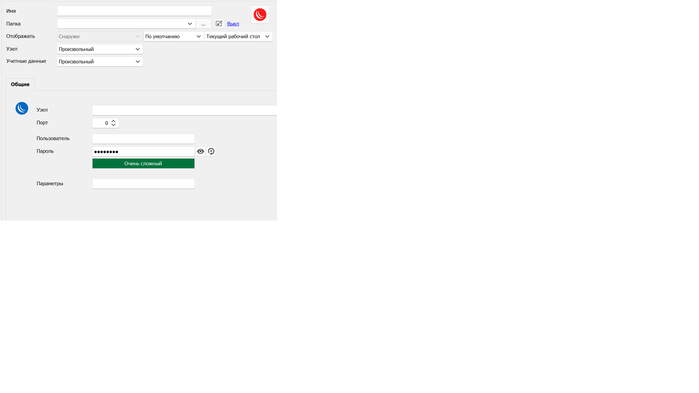
We have a lot of connections through WinBox and before version 2023.2.12.0 we always opened WinBox "Inside (in a tab)" starting from version 2023.2.12.0 the setting switched to "Outside" and turned gray, does not give anything to change. RETURN the very convenient ability to open WinBox "Inside (in a tab)" Now in 2023.2.14.0 it is gray (as in the screenshot) and cannot be changed
PS
We were able to revert to version 2023.1.20.0 to access many WinBox windows in RDM TAB... this is a very handy feature when working with router discovery and discoveries. We don't understand why you expelled her? Please return
VERY small folder icons have become
can you tell me in which release to expect this change ? and where exactly in the interface to enable this option to restore the normal appearance of folder icons?