Compact Layout
3 votes

I did an update to the newest version. But I noticed now that the UI, everything is a lot bigger.
Below is a screenshot of the previous version.
With this increase, I have less pixels available in my remote session.
Is it possible to revert this? Or to have a setting "compact ui"?
I already use the simplified ribbon to have it as small as possible. But this version increased the height a lot.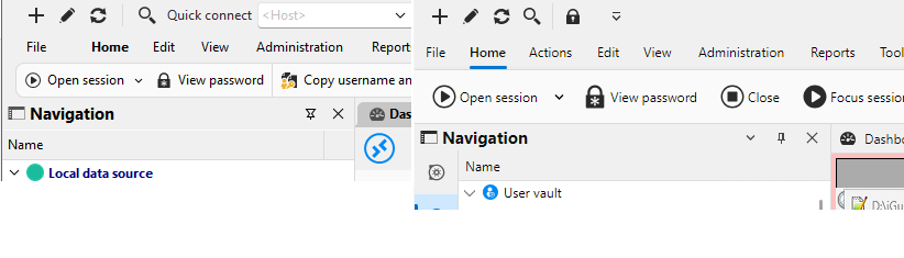
rdmanager.png
Recommended Answer
Hello,
We've reduced the size of items inside of context menus by roughly 4 pixel, which results in a more compact layout. As an additional note, for the main context menu (in the main tree view) you can customize most of its items (any that aren't dynamically generated really), to help only see what you judge is useful to you.
The changes in size should take effect with the upcoming 2026.3.10 version
Regards,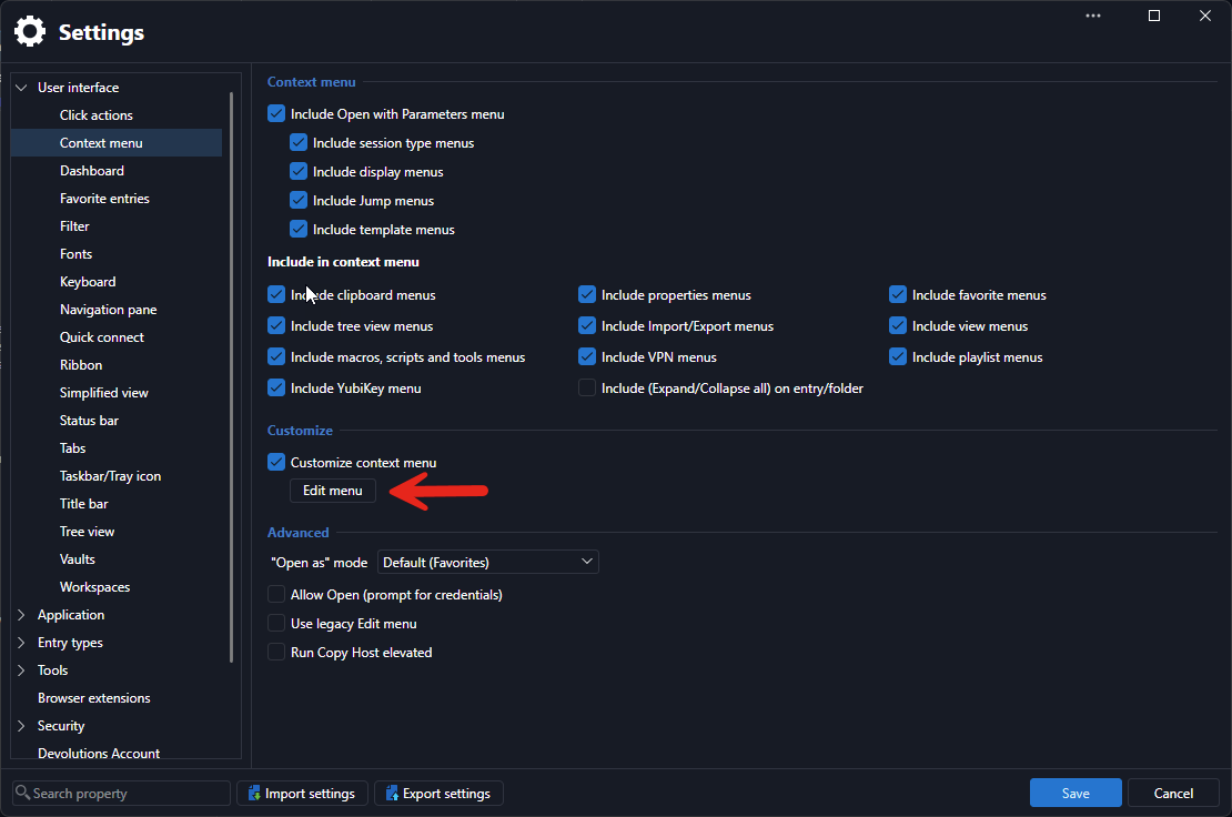
Jafran Majeau
f9d47f04-f909-4393-9661-962285da46a5.png
All Comments (5)
Hello,
Thanks for reporting this. I can see our UI migration definitely played with some margins and sizing. We'll open a ticket and see if we can bring it back a bit more like it was before. We will keep you updated on any progress.
As a side note, if having more space is a big concern of yours, you could try our new "toolbar" mode. You should be able to change to it by clicking on your user icon in the top right of RDM.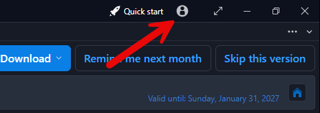
This will make the menu even smaller than before with every option still accessible in the first "hamburger/ collapsible menu" button. You can even right click -> customize it to make any action you want accessible in the title bar for quick access like the other icons you already see available there.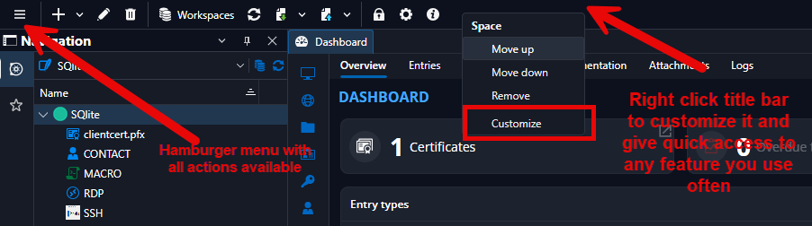
Best Regards,
Michaël Beaudin
1d018e28-52fd-4bb4-a2fd-5accccc44c86.png
06f1f0ad-a881-48a8-9a87-e64aeb8e3cda.png
Hello,
Thanks for reporting this. I can see our UI migration definitely played with some margins and sizing. We'll open a ticket and see if we can bring it back a bit more like it was before. We will keep you updated on any progress.
As a side note, if having more space is a big concern of yours, you could try our new "toolbar" mode. You should be able to change to it by clicking on your user icon in the top right of RDM.
This will make the menu even smaller than before with every option still accessible in the first "hamburger/ collapsible menu" button. You can even right click -> customize it to make any action you want accessible in the title bar for quick access like the other icons you already see available there.
Best Regards,
@Michael Beaudin
Hello, thanks for this suggestion.
I'll have a look and test this.
But keep the ticket, because I noticed that the context menu's etc also have the same increase of padding, which seems "to much" for me.
Hello,
For the original issue with the ribbon, there should be a fix in the upcoming 2026.3.9.0.
Best Regards,
Michaël Beaudin
I also just checked and it does seem there's about a 4 pixel difference in height for the contextual menu items. I'll open a ticket.
Thanks for the info
Michaël Beaudin
Hello,
We've reduced the size of items inside of context menus by roughly 4 pixel, which results in a more compact layout. As an additional note, for the main context menu (in the main tree view) you can customize most of its items (any that aren't dynamically generated really), to help only see what you judge is useful to you.
The changes in size should take effect with the upcoming 2026.3.10 version
Regards,
Jafran Majeau
f9d47f04-f909-4393-9661-962285da46a5.png