Fix dark theme
1 vote
When using RDM on Windows 11 with a dark theme. The theme works well, but some portions need to be a contrasting color.
For example...
> White text on a black background looks great, but selected text is basically black as well, so you can't easily see what you are selection.
>Some check marks are variations of black or almost black with black check marks.
Side note. I have a co-worker with limited eye sight. They would love a high contrast theme.
RDM.jpg
All Comments (9)
Hello,
Thank you for the feedback. For the selection text I agree it's not very visible, we will open a ticket to see what we could change it to and synchronize between our products.
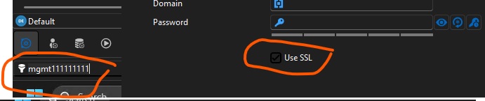
For the "Use SSL" checkbox, do you have a more complete screen capture of this window? I'd like to know which one it is exactly, as it sounds like a bug in our themeing.
Regards,
Hubert Mireault
Also, I forgot to mention, but we are currently reworking our UI framework to use something more flexible. This will help us in the long term support different themes more easily, and maybe even allow users to customize colors manually. Adding a high contrast theme at that time would be more realistic, as right now our current system is not very flexible.
Regards,
Hubert Mireault
Hello,
The checkbox issue should be fixed with the upcoming 2026 version, and the highlighting is based on Windows accent color for now. It isn't something we plan to change soon, but as Hubert specified, we are in the middle of a UI framework change that should fix this issue down the line.
Regards,
Jafran Majeau
Hi,
Thanks for your responses and for making the adjustment!
...the highlighting is based on Windows accent color for now.
@Jafran Majeau
This doesn't seem to be the case?
b8ccb861-5c1e-443b-99aa-70806fc785f6.png
cedacdef-1ee5-44c3-83e1-80136b4b36c3.png
Hello,
I should have been more specific. The highlights when selecting text is based on Windows Accent color themes, but not the "personalized/custom" one, nor specifically the one in your settings, it should be defaulting to the Windows 11 Dark theme default accent color (when using Dark theme on RDM).
That said, in recent months, we've begun a process which includes updating most of our controls, so this might not be accurate everywhere anymore.
However I've tested your initial screenshot, and the highlighting seems better for me than it was for you. If you are on the latest versions (2026), are you still experiencing this issue?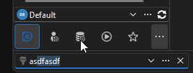
Regards,
Jafran Majeau
adda3798-11c1-49af-b885-7677d330ea04.png
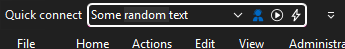
I'm using version 2026.1.12.0 64-bit (JIT). The highlighting for the quick connect text field is worse than the rest.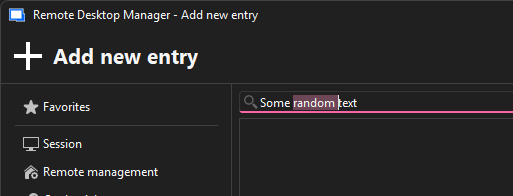
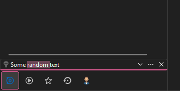
305bd75e-cb20-4e86-929f-eb7f25f7d915.png
d67b04d5-27a6-4c04-ac4f-fd6bc19f66d2.png
Hello,
You're right, the Quick connect seems to be having issues. I will investigate this and come back to you.
I can also see from your screenshot that my personal knowledge of what we support was a little outdated, as the Windows Accent color you picked seems to work (at least for certain fields). That was my mistake.
Regards,
Jafran Majeau
Hello,
I've identified the problem, and we've tasked this UI to be reworked (as it needs to be). Unfortunately I can't provide an ETA at this time, but you can be assured it will be fixed.
Regards,
Jafran Majeau