Add the "Reeconnect" icon to the toolbar
1 vote
Hi!
There's no easy, 1-click way of reconnecting to a SSH session. Would you please add the Reconnect icon to the toolbar? Thanks in advance!
0ca17412-7076-44e0-8243-13abed5ca49a.png
All Comments (11)
Hello,
It should already be available as a button in the "Home" tab of the ribbon: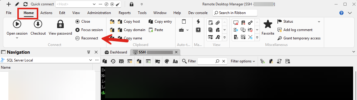
Could you confirm this works for you?
Regards,
Hubert Mireault
f034ec50-7051-421a-bf11-40ddae1d98b7.png
Thank you very much for the workaround, but we don't use Ribbon to be able to maximize screen space available for sessions. We use classic menu. (To be honest, the menu strip could be moved to the RDM window title bar to recover even more space).
There's a space available in the SSH session toolbar, so adding this button is not an issue. To be honest, from my experience, reconnection is - besides clipboard - the most often used thing on an SSH session. Thus when considering where to add the button in the toolbar, please do not add it to the far right-hand side. 😉
I managed to add a keyboard shortcut to the Reconnect command, but my coworker prefers to use mouse for that. I also sometimes find it useful.
Thanks in advance!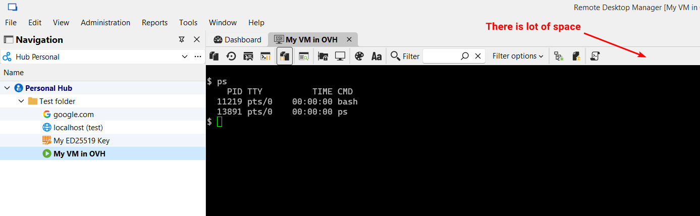
bab99042-e54d-46eb-ae40-b943a7bad6ad.png
Thank you for the further explanation. I'll open a ticket so we can add a button for it there. I understand trying to maximize the space you're given.
For the location you say the following:
Thus when considering where to add the button in the toolbar, please do not add it to the far right-hand side.
By the far right-hand side do you mean docked to the right side (the red arrow), or even where the blue arrow is pointing would be too far?
I was thinking of adding it where the blue arrow is, probably with another separator. Let me know what you think.
Regards,
Hubert Mireault
8ce1e23e-761a-4a5f-bfc8-c0fd07db43e7.png
Yeah I was unclear. I think about placing it even more to the left.
This is truly more often needed than changing color palette or font for the session. 😊
One would say it's a matter of personal taste, but I'll present a UX rationale.
There are 2 kinds of buttons in this toolbar:
- Action buttons - those marked red in the below screenshot.
- Settings buttons - those yellow.
Ideally I'd segregate them, to put small action (red) buttons next to each other, starting from the left (including the new to-be-placed "Reconnect" icon as it performs an important action). Then I'd put filter combo + filter options. To the right of the filter I'd put a vertical separator and then all the yellow setting icons.
In summary, we'd have action buttons + filter + filter options + other options buttons.
I think I wouldn't suggest placing anything aligned to the right, such as the red arrow on your screenshot.
Please consider this.
Thanks!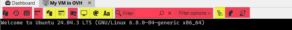
4a5831db-ce0c-4e27-993e-41df77e1ce56.png
Hello,
I think that's a good idea for the logic behind the action placement. I'll add this information to our internal ticket.
Regards,
Hubert Mireault
While we're at it, maybe it would be worthwhile to also add "Duplicate connection" action to this toolbar? That would be super awesome.
Thanks in advance!
No problem, I've added this to our ticket as well.
Regards,
Hubert Mireault
Hello,
I've changed some of the ordering and added the buttons as a proof of concept, can you confirm this is more in line with what you're expecting? I've grouped the more "configuration"-related buttons together after the filter and kept the zModem buttons together. I've also highlighted in yellow the new reconnect and duplicate session buttons.
Let me know what you think.
Regards,
Hubert Mireault
b7161f3d-6bcb-4f1b-b334-130de539432f.png
That looks really great! Thank you!
Perfect, thanks for the confirmation. I'll finalize these changes next week and let you know starting from what version these will be available.
Have a good weekend!
Regards,
Hubert Mireault
Hello,
Just letting you know that these changes to the toolbar will be available starting with RDM 2025.3.16.0. This is not our upcoming version (which is 2025.3.15.0), but the next minor update after that. Once this is available, let us know if there's any issue or additional improvements you would like.
Regards,
Hubert Mireault