Unselected tab coloring
Hi there,
I need a help about setting unselected tabs color. I have many options but:
- "light" is really too light (I use dark colors for entries and the difference is really "strong").
- "transparent" option seems useless (the same of "none").
Any hint?
All Comments (5)
Edit: I've tested more deeply and I want to correct my previous post. "Transparent" adds no color correction, "None" sets color with "no color".
The problem is (in my opinion) that coloring in a lighter way an unselected item is not natural: I would really prefer to have a darker tone for unselected items or, even better, a sort of transparent layer to make it less evident (which would not modify the color code, only his impact). It's the same of enable/disabled standard items in GUI. Another great option would be something on tab label border or similar (for don't touch the background color).
Moreover, "light" effect it's really too light for every color (making the screen a punch of light for eyes). "Light-light" is incredibly uncomfortable (and it's the default).
Hope to add something useful.
Thanks
Hello,
Could you post some screen shot with more details?
Regards
David Hervieux
I need to use very dark colors so the "light" unselected version is not too light:

If I use lighter base colors, unselected ones are really too light:

In any case, active/passive status is not so well perceptible (imho), maybe something less evident for unselected items could be better. For example (just a bunch of ideas):


a44c0017-5a2f-4697-bc51-f9cccd31ee7d.png
d8338014-434b-4a12-9673-3f0ff23b41c9.png
f72970c3-b02a-4de4-b066-12e331ace38c.png
271e1df9-56e7-4fcd-8cf3-7a565bb662e9.png
040fff2b-8fbb-43ce-adc3-d28b408c4a82.png
ed51da04-5f92-42a6-bf84-6f3df9bc8b51.png
7bb58953-f73c-49d9-bd6c-2f243ed76d80.png
913abead-10c4-4f77-a145-d52a5b49eb62.png
Hello,
Thank you. I will try to improve this with the next major version. It's not as simple as it look because the third party we use apply an effect and it's not easy to know the final output.
Regards
David Hervieux
I can understand. Apart from UI components maybe not fully customizable, it's not simple to achieve a good usability/visibility GUI for tabs (in general).
Working on less color difference for status and maybe on borders, seems the only way. For example, the famous Firefox extension "Sidebery" use this method: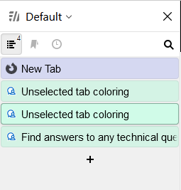
Hope to help.
22251aa5-3fa1-47d3-bc1a-8b534acdb97a.png