Missing window border/shadow in newest version
We've been using RDM V13 for a good while until recently where we finally made an upgrade.
We use RDM thru RemoteApp. I noticed how it over RDP (either full desktop or remoteapp) looks very odd in the newest version: 
Link for full size: https://i.imgur.com/ol9jcmW.png
It is like there is no border/shadow around the main window nor sub-windows like options, etc.
I went ahead installed the latest version locally (both stable and beta) and I can see that here is a border and show visible there. I also tested disabling "windows shadows" - in the windows performance settings - which is something that I know is sometimes disabled automatically in RDP, but this setting did not have any affect on RDM.
Is there any option to enable the "old way" of rendering these borders/shadows of RDM?
All Comments (6)
Hello,
Is it possible to attach a screenshot from RDM installed on your workstation so that we can see the difference between the 2 images because now, I don't see any issue in your screenshot.
Best regards,
Jeff Dagenais
Hm, alright.
Top is how it looks on RDP session, bottom is with local: https://i.imgur.com/5VrgCcw.png - both with clean profiles.
I might just be nitpicking too much, but the borders look cut off. Obviously not a critical bug, just visually annoying, imo.
V13 seemed to have window shadows more similar to other programs, and the "hide windows shadows" option in Windows was respected then while V14 works differently, perhaps in a way that isn't supported by RDP.
Hello,
Thank you for your reply.
I had a chat with our engineering department and it may be possible to add an option to get the border in your type of environment.
A ticket has been opened. The ticket number is RDMW-3719.
Best regards,
Jeff Dagenais
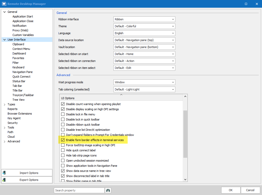
Hello,
We've added an option called "enable form border effects in terminal services":
This will be available in RDM Beta 2019.2.8.0.
Regards,
Hubert Mireault
2019-09-27_10-20-23.png
Must say I'm impressed with how fast this issue was handled, considering it's obviously not exactly critical. Thanks.
While we're talking cosmetics, I also noticed the look of tabs changed drastically. But is it really by design that theres no visual seperation of tabs?
Old version:
New version:
Couldn't some sort of borders on these tabs like the old version also be considered? It looks kinda.. buggy, the way it is now. Maybe it's just me.
I also think it looks odd how the navigation pane header changes color depending on an entry in the navigation pane is selected or not.
Selected:
Unselected:
Again - nothing critical. Maybe just user feedback :)
Thanks,
Hello,
Unfortunately we aren't able to change these, seeing as they are handled by the third party we use. Perhaps in the future we will be able to customize it but for now it's not possible.
Regards,
Hubert Mireault