"Editions" instead of "Edit" on entry context menu in beta 10.9.10.0
"Editions" instead of "Edit" on entry context menu in beta 10.9.10.0
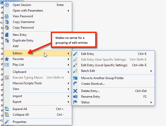
See image. Menu text is nonsense in English.
I really really wish something simple like "edit this entry" wasn't buried two context menus down.
2015-09-02_10-57-08.png
All Comments (12)
Do you have a suggestion for the menu text perhaps "Edit" or "Modify"?
If you want to quickly edit use Properties instead. The Edit Entry is here for legacy purpose.
David Hervieux
Well, you have "new entry" and "duplicate entry" on the context menu of a selected entry, which makes little sense.
IMO, you could lose "new entry" here, replace it with "edit entry" since it would be more useful on a selected context menu and group all the other dross in a "manage" fly-out menu.
Context menus are supposed to be related to the selection. This context menu violates that convention multiple ways.
Duplicate is related to the selection for sure. It also true for New Entry since it create the entry in the selected group or as a sub-connection.
We have changed Edition for Edit now.
David Hervieux
So, why ask for input if you are convinced you have it right?
You never suggested anything in regard of the text.
David Hervieux
Have you tried to click Properties like the in the File Explorer context menu?
David Hervieux
dear yobyot,
there was a feature-request to restructure that menu and it was suggested to use "Edition".
i agree with you "Edition" is not best description and maybe someone will someday suggest a better expression for this menu, but as david said, you didn't.
so if you want do it better, go to feature-request-section and post it there.
regards
markus
Kind Regards
Markus
======================
Here's Google's definition of "edition":
This word, at least in proper English, has nothing to do with manipulating the properties of a selected entry. There are three problems with this menu. One, the wording is incorrect. Two, it's a confusing collection of some things that belong in an "Edit" menu and things that don't. Three, it makes what should be a first-level context menu choice (editing an entry) hard to find because that function is buried in the flyout menu.
This is the core problem with RDM: the UI is illogical and "all over the place."
It's not up to me to design the product. And, as previous responses demonstrate, input isn't at all welcome. Clearly, RDM is "just fine" in the minds of its developers.
Let me say, once again, that I really dislike the a flyout menu for Edit. Why would delete an entry be on the "edit" menu. This is just wrong -- and should be fixed. I dont' need play list or macros or import or export on a first-level context menu. But they are all there, taking up space from from _should_ be on the first-level context menu.
This context menu -- which should designed to be useful _to the task at hand_ -- is over-loaded and, as a result, very frustrating.
You can remove the play list from the context menu now in File->Options | User Interface -> Context Menu
It's not possible for now to remove the macro but that something we can add.
David Hervieux
I'm not asking to remove things -- I'm saying this menu is overloaded and that THE MOST COMMON FUNCTIONS ARE TOO HARD TO FIND and the organization is illogical.
"Delete" for an entry being on the Edit fly-out menu is to common sense what the "shut down" option was to the original Windows "start" button.
Hello,
In the final release, there will be an option in File > Options > User Interface to use the old context menu.
Regards,
Hubert Mireault