Enhancing Visualizations on New-UDNivoChart Line Chart
Product: PowerShell Universal
Version: 3.9.13
Hello all,
I’ve created a line chart using New-UDNivoChart, and I’m wondering if there are any additional adjustments or decorations I can apply to enhance its readability. While I’ve primarily been using New-UDNivoChart, I’m also open to exploring other UD visualizations if you have suggestions.
My current code is as follows:
# Define a list of colors
$colors = @(
    "hsl(272, 70%, 50%)", "hsl(244, 70%, 50%)", "hsl(94, 70%, 50%)",
    "hsl(170, 70%, 50%)", "hsl(130, 70%, 50%)", "hsl(290, 70%, 50%)",
    "hsl(0, 70%, 50%)", "hsl(18, 70%, 50%)", "hsl(36, 70%, 50%)",
    "hsl(54, 70%, 50%)", "hsl(72, 70%, 50%)", "hsl(90, 70%, 50%)",
    "hsl(108, 70%, 50%)", "hsl(126, 70%, 50%)", "hsl(144, 70%, 50%)",
    "hsl(162, 70%, 50%)", "hsl(180, 70%, 50%)", "hsl(198, 70%, 50%)",
    "hsl(216, 70%, 50%)", "hsl(234, 70%, 50%)", "hsl(252, 70%, 50%)",
    "hsl(270, 70%, 50%)", "hsl(288, 70%, 50%)", "hsl(306, 70%, 50%)",
    "hsl(324, 70%, 50%)", "hsl(342, 70%, 50%)"

)
# Query the database to get all mismatched data
$Query = "SELECT * FROM mismatched ORDER BY [date]"
$param = @{
    Connection  = $connection
    Query       = $Query
    ErrorAction = 'Stop'
}

try {
    $data = Read-GacAFdb @param
}
catch {
    Show-UDToast ('ERROR: {0}' -f $_.Exception.Message) -Duration 10000
}

# Build the chart data dynamically
$colorIndex = 0
$chartData = @()

foreach ($column in $data[0].PSObject.Properties) {

    $excludedColumns = @("date", "IsNull", "Value", "RowError", "RowState", "Table", "ItemArray", "HasErrors")
    if ($excludedColumns -notcontains $column.Name -and $column.MemberType -eq 'Property') {

        $dataPoints = @() # Initialize an empty array

        $data | ForEach-Object {
            $value = $_.($column.Name)
            if ($null -eq $value -or $value -eq "Null") {
                $intValue = 0
            }
            else {
                try {
                    $intValue = [int]$value
                }
                catch {
                    $intValue = 0
                }
            }
            $dataPoints += @{
                "x" = $_.date.ToString()
                "y" = $intValue
            }
        }

        $chartDataItem = @{
            "id"    = $column.Name
            "color" = $colors[$colorIndex]
            "data"  = $dataPoints
        }

        $chartData += $chartDataItem

        # Move to the next color
        $colorIndex++
        if ($colorIndex -ge $colors.Length) { $colorIndex = 0 } # Wrap around if we run out of colors
    }
}

# Create a single line chart
New-UDNivoChart -Responsive -Id 'lineChart' -Line -Data $chartData -Height 400 -Width 600 -MarginBottom 50 -MarginTop 50 -MarginRight 110 -MarginLeft 60 -OnClick {
    Show-UDToast -Message $EventData -Duration 3000
}
I’ve attached a visualization of the current chart below. As you can see, there hasn’t been significant movement in the data, making it challenging to determine what each line represents. I did consider creating multiple line charts to distinguish the data, but I’d love to hear any other ideas or recommendations you might have.
@Adam Driscoll any ideas here?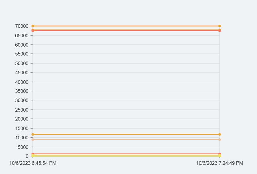
Thank you in advance for your suggestions!
50b159368825615805400555af6cf614db735958.png
All Comments (1)
I used a bar chart also. Iterating over each column as a separate chart
try {
    $Query = "SELECT * FROM mismatched ORDER BY [date]"
    $param = @{
        Connection  = $connection
        Query       = $Query
        ErrorAction = 'Stop'
    }
    $MismatchedForBar = Read-GacAFdb @param
}
catch {
    Show-UDToast ('ERROR: {0}' -f $_.Exception.Message) -Duration 10000
}

$chartCount = 0

# Use New-UDGrid to organize the layout
New-UDGrid -Container -Content {

    # Iterate through each of the properties of the first item in $MismatchedForBar.
    $MismatchedForBar[0].PSObject.Properties | ForEach-Object {
        $columnName = $_.Name
        $excludedColumns = @("date", "IsNull", "Value", "RowError", "RowState", "Table", "ItemArray", "HasErrors")

        # We check if the column is not in the excluded list and is a property.
        if ($columnName -notin $excludedColumns -and $_.MemberType -eq 'Property') {
            $chartCount++

            # Prepare the data for the bar chart for this column.
            $barData = foreach ($item in $MismatchedForBar) {
                $value = $item.$columnName.value
                [pscustomobject]@{
                    'name'  = $item.date.ToString()
                    'value' = if ($null -eq $value -or $value -eq 'Null') { 0 } else { [int]$value }
                }
            }

            # Using grid items with a specific size to control the layout
            New-UDGrid -Item -ExtraSmallSize 3 -Content {
                # UDCard for each chart
                New-UDCard -Content {
                    # Displaying the column name centered above the chart
                    New-UDTypography -Text $columnName -Align 'center' -Variant 'h6'

                    # Display the chart
                    New-UDNivoChart -Bar -Keys 'value' -IndexBy 'name' -Data $barData -Height 400 -Width 500 -Colors 'black' -AxisBottom @{
                        TickRotation = -45; # rotates the ticks by 45 degrees counter-clockwise
                        TickSize     = 5; # size of the tick
                    }
                }
            }


            # If we've hit 4 charts, reset counter and insert a line break
            if ($chartCount -eq 4) {
                $chartCount = 0
                New-UDHtml -Markup '<br>'
            }
        }
    }
}