New-UDChartJS with multiple y-Axes
Product: PowerShell Universal
Version: 4.0.6
I am trying to get a chart with two datasets with a different y-axis (one on the left and one on the right). I can get the two y-Axis labels displaying, but the data seems only to be drawn to the right y-axis scale.
This code:
$data = @(
    @{ Date = '03/07/2023'; Count = (Get-Random -Minimum 3 -Maximum 20); AvgDuration = (Get-Random -Minimum 35 -Maximum 65) }
    @{ Date = '04/07/2023'; Count = (Get-Random -Minimum 3 -Maximum 20); AvgDuration = (Get-Random -Minimum 35 -Maximum 65) }
    @{ Date = '05/07/2023'; Count = (Get-Random -Minimum 3 -Maximum 20); AvgDuration = (Get-Random -Minimum 35 -Maximum 65) }
    @{ Date = '06/07/2023'; Count = (Get-Random -Minimum 3 -Maximum 20); AvgDuration = (Get-Random -Minimum 35 -Maximum 65) }
    @{ Date = '07/07/2023'; Count = (Get-Random -Minimum 3 -Maximum 20); AvgDuration = (Get-Random -Minimum 35 -Maximum 65) }
    @{ Date = '08/07/2023'; Count = (Get-Random -Minimum 3 -Maximum 20); AvgDuration = (Get-Random -Minimum 35 -Maximum 65) }
    @{ Date = '09/07/2023'; Count = (Get-Random -Minimum 3 -Maximum 20); AvgDuration = (Get-Random -Minimum 35 -Maximum 65) }
    @{ Date = '10/07/2023'; Count = (Get-Random -Minimum 3 -Maximum 20); AvgDuration = (Get-Random -Minimum 35 -Maximum 65) }
    @{ Date = '11/07/2023'; Count = (Get-Random -Minimum 3 -Maximum 20); AvgDuration = (Get-Random -Minimum 35 -Maximum 65) }
    @{ Date = '12/07/2023'; Count = (Get-Random -Minimum 3 -Maximum 20); AvgDuration = (Get-Random -Minimum 35 -Maximum 65) }
    @{ Date = '13/07/2023'; Count = (Get-Random -Minimum 3 -Maximum 20); AvgDuration = (Get-Random -Minimum 35 -Maximum 65) }
    @{ Date = '14/07/2023'; Count = (Get-Random -Minimum 3 -Maximum 20); AvgDuration = (Get-Random -Minimum 35 -Maximum 65) }
    @{ Date = '15/07/2023'; Count = (Get-Random -Minimum 3 -Maximum 20); AvgDuration = (Get-Random -Minimum 35 -Maximum 65) }
    @{ Date = '16/07/2023'; Count = (Get-Random -Minimum 3 -Maximum 20); AvgDuration = (Get-Random -Minimum 35 -Maximum 65) }
    @{ Date = '17/07/2023'; Count = (Get-Random -Minimum 3 -Maximum 20); AvgDuration = (Get-Random -Minimum 35 -Maximum 65) }
    @{ Date = '18/07/2023'; Count = (Get-Random -Minimum 3 -Maximum 20); AvgDuration = (Get-Random -Minimum 35 -Maximum 65) }
)

$dataSets = @()

$newUDChartJSDatasetParams = @{
    DataProperty         = 'Count'
    Label                = 'Total'
    BackgroundColor      = '#729ECE'
    BorderColor          = '#1F77B4'
    YAxisId              = 'yAxis'
}
$dataSets += New-UDChartJSDataset @newUDChartJSDatasetParams -BorderWidth 2

$newUDChartJSDatasetParams = @{
    DataProperty         = 'AvgDuration'
    Label                = 'Avg Duration'
    BackgroundColor      = '#FF9E4A'
    BorderColor          = '#FF7F0E'
    YAxisId              = 'yAxis2'
}
$dataSets += New-UDChartJSDataset @newUDChartJSDatasetParams -BorderWidth 2 -AdditionalOptions @{ type = 'line' }

New-UDChartJS -Data $data -Dataset $dataSets -LabelProperty Date -Type bar -Options @{
    responsive = $true
    maintainAspectRatio = $false
    plugins = @{
        legend = @{
            display = $false
        }
    }
    scales = @{
        xAxis = @{
            display = $true
            ticks = @{
                display = $false
            }
        }
        yAxis = @{
            display = $true
            position = 'left'
        }
        yAxis2 = @{
            display = $true
            position = 'right'
            grid = @{
                drawOnChartArea = $false # only want the grid lines for one axis to show up
            }
        }
    }
}
Renders this chart (notice that highlighted data value is scaled against the y-axis on the right and not its own scale?!):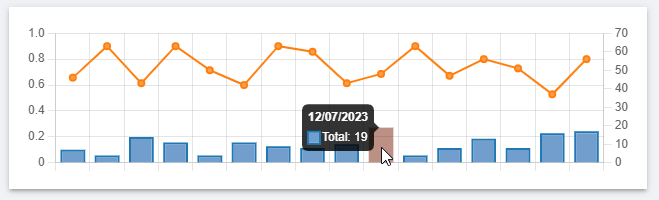
Any ideas what I am doing wrong here? It’s gotta be something simple…
Thanks in advance,
Iain
a472a8bd09f1972924377f9df209f6b4dfc99a23.png
All Comments (4)
Did you ever find a solution to this?
I’m in the same kind of situation, though in my case both are scaled on the left axis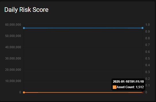
Is this also an issue i v5 @Adam Driscoll?
421e3c0aed09abe2f9973a6988d0055a215a0c47.png
I can reproduce this in v5 as well. Taking a peek. It might be a casing issue with the ChartJS component. Comparing the JSON between the ChartJS docs and PSU, I see that it’s yAxisId in PSU and yAxisID in the docs.
Adam Driscoll
PowerShell Expert and Developer at Devolutions
That was it. This will be resolved in v5.2.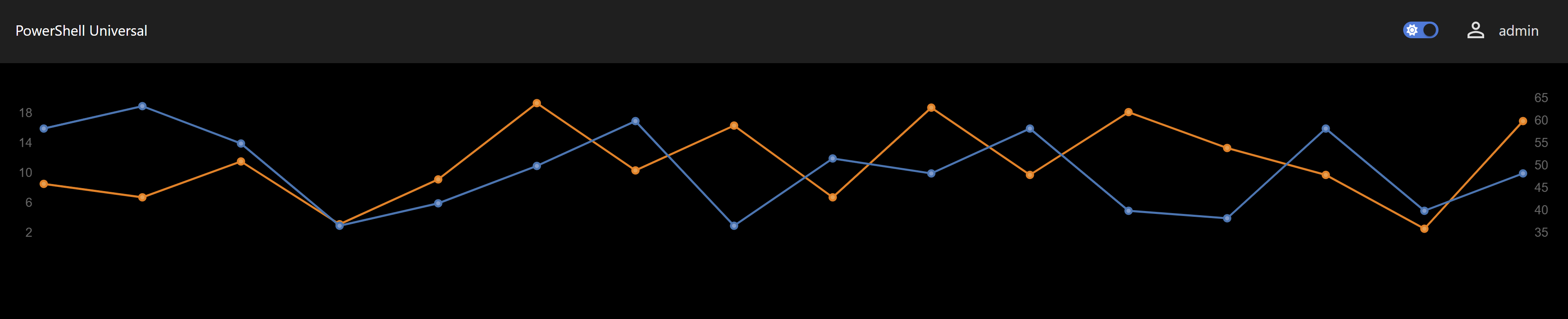
Adam Driscoll
PowerShell Expert and Developer at Devolutions
11b5fd146b253f5a368680007e11413f8d9d8fbd.png
Thank you Adam. Looking forward to finally getting onto v5 with 5.2