AntDesign Issues

Get-PSUInformation

Version  BuildVersion
-------  ------------
2026.2.2 28618653519
Currently having some issues with styles/themes. While looking at the build in '/Apps/Docs' Buttons page the colors listed are very differently from the standard AntDesign theme. Currently trying to achieve the button colors from that page but I can't seem to find the best way in the MaterialUI file. 
 (The 'success' button is currently being hovered over and is slightly darker than normal)
Currently, in my setup, the 'success' and 'error' do not change font color, nor does the hover make the color darker, it actually uses the standard 'blue' color somehow.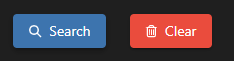
Has anyone found a good way to mimic this using AntDesign? I was able to edit the borderRadius in the MUI file to round the buttons to match.
1ac8ecf9-7a79-4c83-a451-e59b675ba506.png
870fc919-1909-41a7-8363-9fac233323cd.png
ced60dfd-5a15-4a2c-b721-214b5ddf938d.png
All Comments (4)
Hello @btull
Thank you for reporting this and for including the screenshots and PSU build information.
I can see the difference you are describing between the button colors shown under /Apps/Docs and the behavior you are getting with the AntDesign theme, particularly for the success and error colors and their hover states.
PowerShell Universal Apps use the MUI theme system, and the current documentation supports customizing palette values as well as component specific overrides. Before determining whether this is expected theme behavior or something specific to PSU 2026.2.2, I would like to compare the exact configuration being applied.
Could you please share:
• A minimal example of the New-UDButton commands used for the secondary, success, and error buttons.
• The relevant portion of your theme containing palette, MuiButton, or other button related overrides.
• Whether the same behavior occurs in a minimal App using the AntDesign theme without any custom overrides.
• Whether these colors behaved differently for you on an earlier PSU version, if applicable.
If possible, it would also be useful to inspect one affected button with the browser developer tools and confirm which CSS classes and computed background color / text color values are being applied in both the normal and hover states.
Because this is a public forum, please sanitize all evidence before posting. Remove credentials, tokens, license keys, cookies, private keys, full connection strings, email addresses, usernames, customer data, tenant or account identifiers, internal domains, hostnames, IP addresses, and private URLs. Please do not upload unredacted HAR files, memory dumps, database backups, or complete configuration files to this public thread.
References:
https://docs.devolutions.net/powershell-universal/apps/themes
Best regards,
Ruben Tapia
Hello @btull
Thank you for reporting this and for including the screenshots and PSU build information.
I can see the difference you are describing between the button colors shown under /Apps/Docs and the behavior you are getting with the AntDesign theme, particularly for the success and error colors and their hover states.
PowerShell Universal Apps use the MUI theme system, and the current documentation supports customizing palette values as well as component specific overrides. Before determining whether this is expected theme behavior or something specific to PSU 2026.2.2, I would like to compare the exact configuration being applied.
Could you please share:
• A minimal example of the New-UDButton commands used for the secondary, success, and error buttons.
• The relevant portion of your theme containing palette, MuiButton, or other button related overrides.
• Whether the same behavior occurs in a minimal App using the AntDesign theme without any custom overrides.
• Whether these colors behaved differently for you on an earlier PSU version, if applicable.
If possible, it would also be useful to inspect one affected button with the browser developer tools and confirm which CSS classes and computed background color / text color values are being applied in both the normal and hover states.
Because this is a public forum, please sanitize all evidence before posting. Remove credentials, tokens, license keys, cookies, private keys, full connection strings, email addresses, usernames, customer data, tenant or account identifiers, internal domains, hostnames, IP addresses, and private URLs. Please do not upload unredacted HAR files, memory dumps, database backups, or complete configuration files to this public thread.
References:
https://docs.devolutions.net/powershell-universal/apps/themes
Best regards,
Ruben Tapia
@rubentapia
Thanks, Ruben. I'm not using anything special for the UDButtons. Just the standard 'New-UDButton' with '-Icon' and '-Text' and mainly an 'OnClick'. I have a dev environment on 4.5.5 and I made a page solely with buttons to test. I copied the code to both my 4.5.5. environment and my 2026.2.2 environment.
New-UDButton -Text 'default/contained' -Color default -Variant contained
New-UDButton -Text 'default/outlined' -Color default -Variant outlined
New-UDButton -Text 'default/text' -Color default -Variant text
New-UDHtml -Markup '<br>'
New-UDButton -Text 'info/contained' -Color info -Variant contained
New-UDButton -Text 'info/outlined' -Color info -Variant outlined
New-UDButton -Text 'info/text' -Color info -Variant text
New-UDHtml -Markup '<br>'
New-UDButton -Text 'primary/contained' -Color primary -Variant contained
New-UDButton -Text 'primary/outlined' -Color primary -Variant outlined
New-UDButton -Text 'primary/text' -Color primary -Variant text
New-UDHtml -Markup '<br>'
New-UDButton -Text 'secondary/contained' -Color secondary -Variant contained
New-UDButton -Text 'secondary/outlined' -Color secondary -Variant outlined
New-UDButton -Text 'secondary/text' -Color secondary -Variant text
New-UDHtml -Markup '<br>'
New-UDButton -Text 'success/contained' -Color success -Variant contained
New-UDButton -Text 'success/outlined' -Color success -Variant outlined
New-UDButton -Text 'success/text' -Color success -Variant text
New-UDHtml -Markup '<br>'
New-UDButton -Text 'warning/contained' -Color warning -Variant contained
New-UDButton -Text 'warning/outlined' -Color warning -Variant outlined
New-UDButton -Text 'warning/text' -Color warning -Variant text
New-UDHtml -Markup '<br>'
New-UDButton -Text 'error/contained' -Color error -Variant contained
New-UDButton -Text 'error/outlined' -Color error -Variant outlined
New-UDButton -Text 'error/text' -Color error -Variant text
This is the only code on that page, which is part of a 'New-UDApp' with a navigation pane. Here is what that page looks like.
4.5.5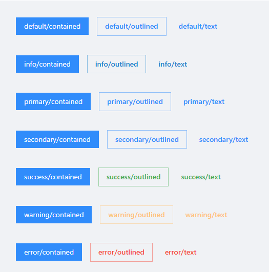
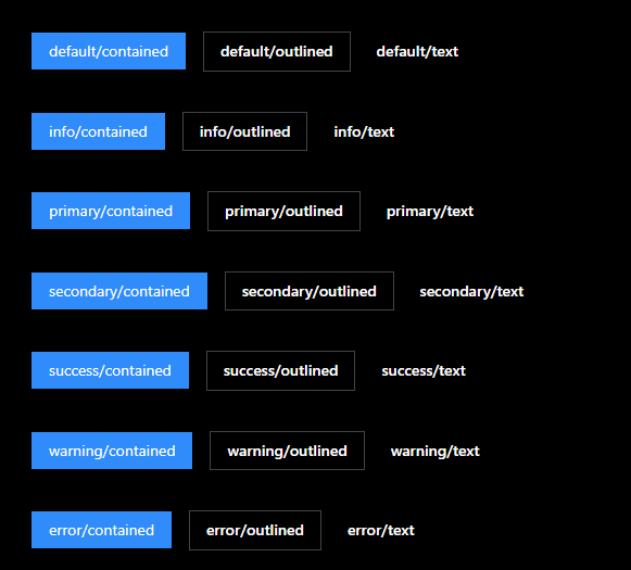 On this environment, I am running all dashboards using a 'custom' PS7 environment, running 7.5.4. No extra add-ins or anything just not using the Integrated PS7 environment.
Get-UDTheme -Name AntDesign | Convertto-Json -Depth 100
{
  "dark": {
    "typography": {
      "h6": {
        "fontSize": 14,
        "fontWeight": 400
      },
      "fontFamily": "-apple-system,BlinkMacSystemFont,'Segoe UI',Roboto,'Helvetica Neue',Arial,'Noto Sans',sans-serif,'Apple Color Emoji','Segoe UI Emoji','Segoe UI Symbol','Noto Color Emoji'",
      "body1": {
        "fontSize": 14
      }
    },
    "palette": {
      "error": {
        "xLight": "#ffebee",
        "dark": "#d32f2f",
        "main": "#f44336"
      },
      "primary": {
        "main": "rgb(31, 31, 31)"
      },
      "warning": {
        "main": "#ffc071",
        "dark": "#ffb25e"
      },
      "success": {
        "xLight": "#e8f5e9",
        "dark": "#388e3c",
        "main": "#4caf50"
      },
      "text": {
        "primary": "rgba(255, 255, 255, 0.85)",
        "secondary": "rgba(255, 255, 255, 0.38)",
        "disabled": "rgba(255, 255, 255, 0.38)"
      },
      "background": {
        "default": "#000"
      }
    },
    "overrides": {
      "MuiButton": {
        "outlined": {
          "borderRadius": 0,
          "border": "1px solid #434343",
          "&:hover": {
            "borderColor": "#165996",
            "color": "#165996"
          }
        },
        "root": {
          "&.Mui-disabled": {
            "color": "rgba(255, 255, 255, 0.50);"
          },
          "color": "#fff",
          "textTransform": "none"
        },
        "contained": {
          "transition": "all .3s cubic-bezier(.645,.045,.355,1)",
          "borderRadius": 0,
          "&:hover": {
            "borderColor": "#40a9ff",
            "color": "#fff",
            "backgroundColor": "#40a9ff",
            "boxShadow": null
          },
          "lineHeight": 1.5715,
          "fontWeight": 400,
          "backgroundColor": "#1890ff",
          "borderColor": "#1890ff",
          "boxShadow": null,
          "color": "#fff"
        }
      }
    }
  },
  "light": {
    "typography": {
      "h6": {
        "fontSize": 14,
        "fontWeight": 400
      },
      "fontFamily": "-apple-system,BlinkMacSystemFont,'Segoe UI',Roboto,'Helvetica Neue',Arial,'Noto Sans',sans-serif,'Apple Color Emoji','Segoe UI Emoji','Segoe UI Symbol','Noto Color Emoji'",
      "body1": {
        "fontSize": 14
      }
    },
    "palette": {
      "error": {
        "xLight": "#ffebee",
        "dark": "#d32f2f",
        "main": "#f44336"
      },
      "primary": {
        "main": "#1890ff",
        "dark": "#1e1e1f",
        "light": "#69696a"
      },
      "warning": {
        "main": "#ffc071",
        "dark": "#ffb25e"
      },
      "success": {
        "xLight": "#e8f5e9",
        "dark": "#388e3c",
        "main": "#4caf50"
      },
      "text": {
        "disabled": "rgba(0, 0, 0, 0.50)"
      },
      "secondary": {
        "main": "#1890ff",
        "dark": "#e62958",
        "light": "#1890ff"
      },
      "background": {
        "default": "#f0f2f5"
      }
    },
    "overrides": {
      "MuiListItemIcon": {
        "root": {
          "&:hover": {
            "color": "#1890ff"
          },
          "minWidth": "25px"
        }
      },
      "MuiButton": {
        "contained": {
          "backgroundColor": "#1890ff",
          "transition": "all .3s cubic-bezier(.645,.045,.355,1)",
          "lineHeight": 1.5715,
          "color": "#fff",
          "borderColor": "#1890ff",
          "fontWeight": 400
        },
        "root": {
          "borderRadius": 0,
          "&:hover": {
            "borderColor": "#40a9ff",
            "color": "#fff",
            "backgroundColor": "#40a9ff",
            "boxShadow": "none"
          },
          "textTransform": "none",
          "boxShadow": "none"
        }
      }
    }
  }
}
This is the standard AntDesign. I just removed all other MUI settings to shorten the codeblock.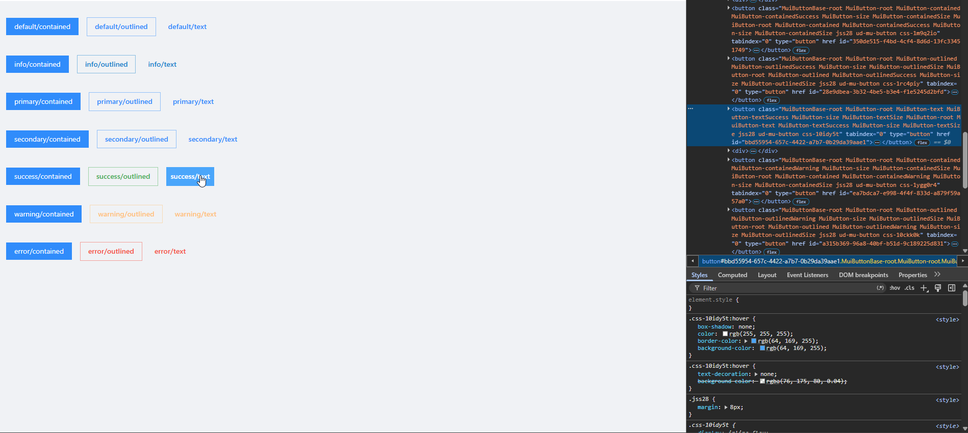
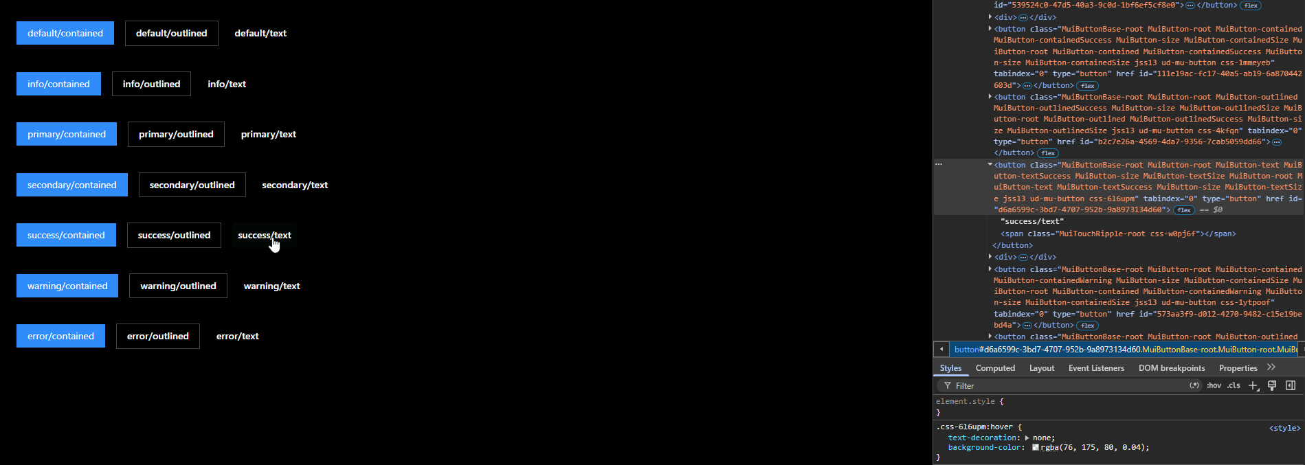 On the light theme, the 'hover' aspect on the 'text' variant just changes the entire button to blue, however on the dark theme, it uses an RGBA scale but the Alpha is set to such a low number that you can't see the color at all.
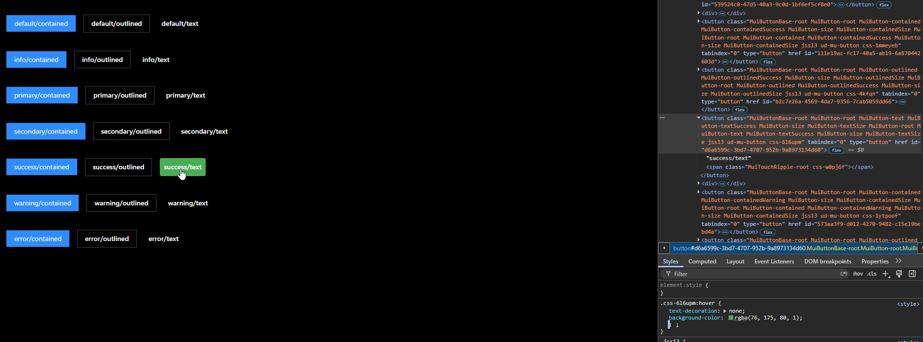 Changing the alpha to '1' vs '0.04', you can clearly see the color of the button. This is exactly the same with the 2026.2.2 version. The 'hover' for the other buttons ('contained' and 'outlined') just set the button to be a darker blue, or darker blue outline, respectively.
2026.2.2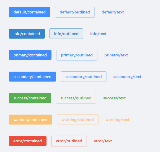
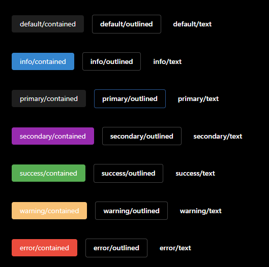 On this environment, I am running all dashboards using a 'custom' PS7 environment, running 7.6.5. No extra add-ins or anything just not using the Integrated PS7 environment.
Get-UDTheme -Name AntDesign | Convertto-Json -Depth 100
{
  "light": {
    "typography": {
      "fontFamily": "-apple-system,BlinkMacSystemFont,'Segoe UI',Roboto,'Helvetica Neue',Arial,'Noto Sans',sans-serif,'Apple Color Emoji','Segoe UI Emoji','Segoe UI Symbol','Noto Color Emoji'",
      "h6": {
        "fontWeight": 400,
        "fontSize": 14
      },
      "body1": {
        "fontSize": 14
      }
    },
    "overrides": {
      "MuiButton": {
        "root": {
          "boxShadow": "none",
          "borderRadius": 4,
          "&:hover": {
            "borderColor": "#2c75b0",
            "boxShadow": "none",
            "backgroundColor": "#2c75b0",
            "color": "#fff"
          },
          "textTransform": "none"
        },
        "contained": {
          "lineHeight": 1.5715,
          "color": "#fff",
          "transition": "all .3s cubic-bezier(.645,.045,.355,1)",
          "fontWeight": 400
        }
      }
    },
    "palette": {
      "background": {
        "default": "#f0f2f5"
      },
      "error": {
        "dark": "#d32f2f",
        "main": "#f44336",
        "xLight": "#ffebee"
      },
      "text": {
        "disabled": "rgba(0, 0, 0, 0.50)"
      },
      "secondary": {
        "dark": "#e62958",
        "main": "#1890ff",
        "light": "#1890ff"
      },
      "primary": {
        "dark": "#1e1e1f",
        "main": "#1890ff",
        "light": "#69696a"
      },
      "warning": {
        "main": "#ffc071",
        "dark": "#ffb25e"
      },
      "success": {
        "dark": "#388e3c",
        "main": "#4caf50",
        "xLight": "#e8f5e9"
      }
    }
  },
  "dark": {
    "typography": {
      "fontFamily": "-apple-system,BlinkMacSystemFont,'Segoe UI',Roboto,'Helvetica Neue',Arial,'Noto Sans',sans-serif,'Apple Color Emoji','Segoe UI Emoji','Segoe UI Symbol','Noto Color Emoji'",
      "h6": {
        "fontWeight": 400,
        "fontSize": 14
      },
      "body1": {
        "fontSize": 14
      }
    },
    "overrides": {
      "MuiButton": {
        "contained": {
          "lineHeight": 1.5715,
          "borderRadius": 4, #<------ Changed from standard of '0' to '4'
          "transition": "all .3s cubic-bezier(.645,.045,.355,1)",
          "fontWeight": 400,
          "boxShadow": null,
          "color": "#fff",
          "&:hover": {
            "borderColor": "#2c75b0",
            "boxShadow": null,
            "backgroundColor": "#2c75b0",
            "color": "#fff"
          }
        },
        "outlined": {
          "borderRadius": 4,
          "border": "1px solid #434343",
          "&:hover": {
            "color": "#165996",
            "borderColor": "#165996"
          }
        },
        "root": {
          "color": "#fff",
          "&.Mui-disabled": {
            "color": "rgba(255, 255, 255, 0.50);"
          },
          "textTransform": "none"
        }
      },
    },
    "palette": {
      "background": {
        "default": "#000"
      },
      "error": {
        "dark": "#d32f2f",
        "main": "#f44336",
        "xLight": "#ffebee"
      },
      "text": {
        "secondary": "rgba(255, 255, 255, 0.38)",
        "primary": "rgba(255, 255, 255, 0.85)",
        "disabled": "rgba(255, 255, 255, 0.38)"
      },
      "primary": {
        "main": "rgb(31, 31, 31)"
      },
      "warning": {
        "main": "#ffc071",
        "dark": "#ffb25e"
      },
      "success": {
        "dark": "#388e3c",
        "main": "#4caf50",
        "xLight": "#e8f5e9"
      }
    }
  }
}
This is the standard AntDesign. I just removed all other MUI settings to shorten the codeblock. The only custom settings is on the MUIButton, utilizing a custom 'borderRadius' to make the buttons round.
I don't believe 4.5.5 has a 'minimal' environment. I know this is a setting in 2026.2.2 but I'm not currently utilizing it.
fae7f04f-9ed5-43a2-be29-621a66a40f25.png
6c96599f-c339-4f99-b33e-f586330de581.png
e095838c-2fa5-45d0-ab4a-e90aa301b3a9.png
8b19e002-115c-4745-9305-e01e1b99e466.png
977b1700-399e-4977-80f5-530147baab1a.png
fb87dc1c-3e97-494f-b915-1c8d70232366.png
88e5a0e7-67b9-4b73-9db3-0d83ed1c605d.png
Hello @btull
Thank you again for the detailed information and testing you provided.
We are currently completing an internal lab to validate the AntDesign button behavior under controlled conditions and gather the necessary evidence for proper escalation.
Your comparison between versions, the AntDesign theme output, and the DevTools findings have been very helpful in narrowing down the behavior we need to validate.
I will update this thread once the lab is completed and we have the results documented.
Best regards,
Ruben Tapia
Hello @btull
Thank you again for the detailed testing and evidence you provided.
We have now completed our internal lab and were able to reproduce the AntDesign button behavior using the stock theme on PSU 2026.2.2.
Our testing confirmed that the built-in AntDesign MuiButton hover overrides can replace the semantic button colors with fixed blue styling for contained and outlined variants. We also confirmed that, in Dark Mode, text variants can use the correct semantic color but with a very low hover opacity, making the visual change difficult to perceive.
The behavior was deterministic during our testing, and we also confirmed that the AntDesign theme definition remains unchanged in the PSU 2026.3.0 package we reviewed.
We validated a scoped theme adjustment that preserves the semantic colors during hover, but since the behavior originates from the built-in AntDesign theme, we will proceed with an internal Development escalation for confirmation and review of the intended behavior.
I will update this thread once we receive additional feedback from Development.
Best regards,
Ruben Tapia