PSU 5.x Login Page Theming
Product: PowerShell Universal
Version: 5.5.1
I wanted to share my css login page with those who want to customize their login page.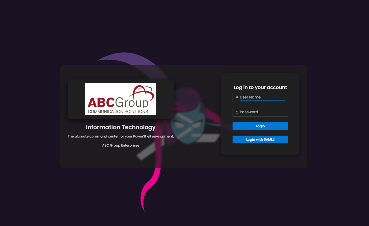
Setup
- First make sure to create a Published Folder (Platform > Published Folders).Request Path: /assets
- Path: C:\PSUAssets (example)
- Name: PSUAssets
- Create a CSS file in the path you specified named “psu-login-style.css”
- You should now have access to the CSS using a URL: https://[MY_PSU_SERVER]/assets/psu-login-style.css
You can customize the look by editing the CSS file, like logo file name (default is bg.png, located in the same folder as the css file).
CSS code:
/* PowerShell Universal 5.5 Custom Login Page Stylesheet */

/* Import a prettier font */
@import url('https://fonts.googleapis.com/css2?family=Poppins:wght@300;400;500;600;700&display=swap');

/* CSS variable for easy font swapping */
:root {
  --font-sans: 'Poppins', sans-serif;
}

/* 0. Apply the new font globally */
body,
.ant-typography,
.ant-input,
.ant-btn {
  font-family: var(--font-sans) !important;
}

/* Title: heavier weight */
#titleText {
  font-weight: 600 !important;  /* semi-bold */
}

/* Description & footer: regular weight */
#description,
.login-footer {
  font-weight: 400 !important;
}

/* Inputs & buttons: medium weight */
.ant-input,
.ant-btn {
  font-weight: 500 !important;
}

/* 1. Full-viewport background */
section.ant-layout,
.ant-layout {
  background: url('/assets/bg.png') center/cover no-repeat !important;
  height: 100vh !important;
}

/* 2. Semi-transparent dark grey overlay on content area with padding & blur */
.ant-layout_content {
  background-color: rgba(32, 32, 32, 0.7) !important;
  padding: 2rem !important;
  border-radius: 1rem !important;
  backdrop-filter: blur(3px) !important;
  -webkit-backdrop-filter: blur(3px) !important;
}

/* 3. Center the login container */
section.ant-layout {
  display: flex !important;
  align-items: center !important;
  justify-content: center !important;
  padding: 2rem !important;
}

/* 4. Frosted, semi-transparent dark grey login card */
#loginCard {
  background-color: rgba(32, 32, 32, 0.5) !important;
  border: none !important;
  backdrop-filter: blur(20px) !important;
  border-radius: 1rem !important;
  box-shadow: 0 4px 20px rgba(0, 0, 0, 0.5) !important;
  padding: 1.5rem !important;
}

/* 5. Logo container with padding and frosted-glass effect */
#logo {
  display: flex !important;
  flex: 0 !important;
  align-items: center !important;
  justify-content: center !important;
  padding: 1rem !important;
  background-color: rgba(32, 32, 32, 0.8) !important;
  backdrop-filter: blur(12px) !important;
  -webkit-backdrop-filter: blur(12px) !important;
  border-radius: 0.75rem !important;
  box-shadow: 0 8px 30px rgba(0, 0, 0, 0.7) !important;
  margin: 0 auto 1rem !important;
}

/* 6. Ensure the <img> inside #logo sits at your desired size */
#logo img {
  width: 300px !important;
  height: auto !important;
  display: block;
}

/* 7. Force title to sit under the logo */
#titleContainer {
  display: block !important;
  margin: 0 auto 0.5rem !important;
  text-align: center !important;
}

/* 8. Force description to sit under the title */
#description {
  display: block !important;
  margin: 0 auto 1rem !important;
  text-align: center !important;
}

/* 9. Center the “ABC Group Enterprises” line under the description */
#description + .ant-space-item {
  display: block !important;
  margin: 0 auto 1.5rem !important;
}
#description + .ant-space-item .ant-typography {
  text-align: center !important;
}

/* 10. Input fields */
.ant-input {
  background: transparent !important;
  border: none !important;
  border-bottom: 2px solid rgba(255, 255, 255, 0.5) !important;
  color: #fff !important;
  font-size: 1rem !important;
}
.ant-input::placeholder {
  color: rgba(255, 255, 255, 0.6) !important;
}
.ant-input-focused,
.ant-input:focus {
  border-bottom-color: #005a9e !important;
  outline: none !important;
}

/* 11. Primary button styling */
.ant-btn-primary {
  background-color: #0078d4 !important;
  border-color: #0078d4 !important;
  color: #fff !important;
  display: flex !important;
  align-items: center !important;
  justify-content: center !important;
  padding: 0.75rem 1.5rem !important;
}
.ant-btn-primary:hover {
  background-color: #005a9e !important;
}

/* 12. Footer text */
.login-footer {
  text-align: center !important;
  margin-top: 1rem !important;
  color: rgba(255, 255, 255, 0.7) !important;
  font-size: 0.875rem !important;
}

/* 13. Login with SAML2 button centering */
a.ant-btn.ant-btn-primary.ant-btn-block,
.ant-btn-block {
  display: flex !important;
  align-items: center !important;
  justify-content: center !important;
  padding: 0.75rem 1.5rem !important;
  color: #fff !important;
}
.ant-btn-block:hover {
  background-color: #005a9e !important;
}- make sure to add the css to your branding under Login Page CSS Stylesheet (Settings > Branding > Login Page > Login Page CSS Stylesheet), use the URL to the css file.
- Make sure to select “Horizontal” as your Login Page Layout
21d93dfeff45dfa20470a65f934ebf54a6846aba.png
All Comments (4)
Thanks for sharing!
Been meaning to spend some time on our login page but my lack of CSS knowledge has been demotivating. This helps a lot!
Very nice!
Thank you! This is awesome!
Thank you for this. This is an awesome resource to learn from!