Theme overrides / custom styling for New-UDTooltip -TooltipContent?
Theme overrides / custom styling for New-UDTooltip -TooltipContent?
Was looking to use New-UDTooltip to better indicate the click-to-copy functionality we’ve added into our dashboards, but I don’t seem to be able to style it with overrides as I would the other Mui components within the light/dark theme we have.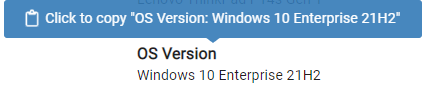
It seems to be applying an inline style with a random GUID name, in this case t5458db87-f755-4b1e-8404-9f41954f148b:
<style aria-hidden="true">
  	.t5458db87-f755-4b1e-8404-9f41954f148b {
	    color: #fff;
	    background: #337AB7;
	    border: 1px solid transparent;
  	}

  	.t5458db87-f755-4b1e-8404-9f41954f148b.place-top {
        margin-top: -10px;
    }
    .t5458db87-f755-4b1e-8404-9f41954f148b.place-top::before {
        border-top: 8px solid transparent;
    }
    .t5458db87-f755-4b1e-8404-9f41954f148b.place-top::after {
        border-left: 8px solid transparent;
        border-right: 8px solid transparent;
        bottom: -6px;
        left: 50%;
        margin-left: -8px;
        border-top-color: #337AB7;
        border-top-style: solid;
        border-top-width: 6px;
    }

    .t5458db87-f755-4b1e-8404-9f41954f148b.place-bottom {
        margin-top: 10px;
    }
    .t5458db87-f755-4b1e-8404-9f41954f148b.place-bottom::before {
        border-bottom: 8px solid transparent;
    }
    .t5458db87-f755-4b1e-8404-9f41954f148b.place-bottom::after {
        border-left: 8px solid transparent;
        border-right: 8px solid transparent;
        top: -6px;
        left: 50%;
        margin-left: -8px;
        border-bottom-color: #337AB7;
        border-bottom-style: solid;
        border-bottom-width: 6px;
    }

    .t5458db87-f755-4b1e-8404-9f41954f148b.place-left {
        margin-left: -10px;
    }
    .t5458db87-f755-4b1e-8404-9f41954f148b.place-left::before {
        border-left: 8px solid transparent;
    }
    .t5458db87-f755-4b1e-8404-9f41954f148b.place-left::after {
        border-top: 5px solid transparent;
        border-bottom: 5px solid transparent;
        right: -6px;
        top: 50%;
        margin-top: -4px;
        border-left-color: #337AB7;
        border-left-style: solid;
        border-left-width: 6px;
    }

    .t5458db87-f755-4b1e-8404-9f41954f148b.place-right {
        margin-left: 10px;
    }
    .t5458db87-f755-4b1e-8404-9f41954f148b.place-right::before {
        border-right: 8px solid transparent;
    }
    .t5458db87-f755-4b1e-8404-9f41954f148b.place-right::after {
        border-top: 5px solid transparent;
        border-bottom: 5px solid transparent;
        left: -6px;
        top: 50%;
        margin-top: -4px;
        border-right-color: #337AB7;
        border-right-style: solid;
        border-right-width: 6px;
    }
</style>
I tried using the overrides using that GUID or the __react_component_tooltip class, and neither was fruitful. Has anyone had experience modifying these styles from PSU, with a dark/light theme?
Adam
Product: PowerShell Universal
Version: 3.7.14
e38fefaa605a937155fbb14f35137e683ef7c5d1.png
Recommended Answer
Was able to get this corrected using the globalStyle property of the theme overrides.
$lightGlobalStyle = @"
    .__react_component_tooltip {
        background-color: #003168 !important;
        color: #E7EEF1 !important;
    }
    .__react_component_tooltip::after {
        border-top-color: #003168 !important;
    }
    .__react_component_tooltip::before {
        border-top-color: #003168 !important;
    }
    .iziToast {
        background-color: rgba(231, 238, 241, 0.95) !important;
    }
    .iziToast-message {
        color: rgba(0, 49, 104, 0.9) !important;
    }
    .iziToast-icon {
        color: #003168 !important;
    }
    .iziToast-progressbar {
        background-color: rgba(231, 238, 241, 0.9) !important;
    }
    .iziToast-progressbar > div {
        background-color: rgba(0, 49, 104, 0.9) !important;
    }
"@

$darkGlobalStyle = @"
    .__react_component_tooltip {
        background-color: #51B5E0 !important;
        color: #2E2E2E !important
    }
    .__react_component_tooltip::after {
        border-top-color: #51B5E0 !important;
    }
    .__react_component_tooltip::before {
        border-top-color: #51B5E0 !important;
    }
    .iziToast {
        background-color: rgba(81, 181, 224, 0.95) !important;
    }
    .iziToast-message {
        color: rgba(0, 0, 0, 0.98) !important;
    }
    .iziToast-icon {
        color: #000000 !important;
    }
    .iziToast-progressbar > div {
        background-color: rgba(46, 46, 46, 0.75) !important;
    }
    .iziToast-progressbar {
        background-color: rgba(231, 238, 241, 0.9) !important;
    }
"@

$Theme = @{
    light = @{
        globalStyle = $lightGlobalStyle
        [...]
    }
    dark = @{
        globalStyle = $darkGlobalStyle
        [...]
    }
}

New-UDDashboard -Title "Title" -Pages {...} -Theme $Theme
All Comments (2)
Was able to get this corrected using the globalStyle property of the theme overrides.
$lightGlobalStyle = @"
    .__react_component_tooltip {
        background-color: #003168 !important;
        color: #E7EEF1 !important;
    }
    .__react_component_tooltip::after {
        border-top-color: #003168 !important;
    }
    .__react_component_tooltip::before {
        border-top-color: #003168 !important;
    }
    .iziToast {
        background-color: rgba(231, 238, 241, 0.95) !important;
    }
    .iziToast-message {
        color: rgba(0, 49, 104, 0.9) !important;
    }
    .iziToast-icon {
        color: #003168 !important;
    }
    .iziToast-progressbar {
        background-color: rgba(231, 238, 241, 0.9) !important;
    }
    .iziToast-progressbar > div {
        background-color: rgba(0, 49, 104, 0.9) !important;
    }
"@

$darkGlobalStyle = @"
    .__react_component_tooltip {
        background-color: #51B5E0 !important;
        color: #2E2E2E !important
    }
    .__react_component_tooltip::after {
        border-top-color: #51B5E0 !important;
    }
    .__react_component_tooltip::before {
        border-top-color: #51B5E0 !important;
    }
    .iziToast {
        background-color: rgba(81, 181, 224, 0.95) !important;
    }
    .iziToast-message {
        color: rgba(0, 0, 0, 0.98) !important;
    }
    .iziToast-icon {
        color: #000000 !important;
    }
    .iziToast-progressbar > div {
        background-color: rgba(46, 46, 46, 0.75) !important;
    }
    .iziToast-progressbar {
        background-color: rgba(231, 238, 241, 0.9) !important;
    }
"@

$Theme = @{
    light = @{
        globalStyle = $lightGlobalStyle
        [...]
    }
    dark = @{
        globalStyle = $darkGlobalStyle
        [...]
    }
}

New-UDDashboard -Title "Title" -Pages {...} -Theme $Theme Well, this solution did work in 3.x but with the changes to tooltips in 4.x it’s now defunct.
I’ve been trying to tweak the theme overrides but it appears to only have a single class - MuiTooltip-tooltip for all of the different types. Anyone had success with styling these new tooltips?