Option to hide filter bar in vault "window" for DVLS
0 vote
Since the 2024.1 update, we've had several users get confused by the new layout. I can't say if I recall there being a filter bar and a search bar before, but now that the search bar is above the vault name, it is stacked above the filter bar that is below the vault name. We've had several users mistake the filter bar as a search bar, causing us to explain that the filter bar only returns literal matches to what is typed in. We were told through ticket 00058066 that hiding the filter bar was not currently an option and that we should enter it in as a feature request.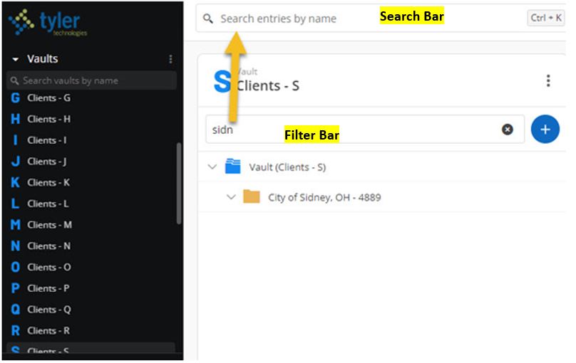
Search&FilterBars.JPG
All Comments (9)
Hello,
Thank you for your request. You're right; we added the filter bar in the last version. I'm sorry to hear that it created confusion to your users, and we will see how we can improve that with pleasure. I would be curious to know more about why people get confused and why they don't find the records they need. You wrote "filter bar only returns literal matches", do you mean that your users don't search by entry name and use something else, probably one of those fields?
It is true that the filter is looking only at the entry name, so I'm wondering if that is the issue for your users. Or maybe they want to search in all vaults? Because the filter is applied only to the current vault. I would really appreciate it if you could explain to me why they don't find what they need. It would help us to improve that filter.
Best regards,
François Dubois
306229b9-29b9-45e2-bc51-686ed8fde257.png
Thanks for the reply Francois. I think they went to the filter bar as a search first because it was right within the vault window, not realizing that there were two bars in view and each served a different purpose. The screenshot I provided with my post is an example of the filter bar being literal. The user started typing in the name Sidney to bring up the record for City of Sidney, OH. As you can see from the screenshot, the only thing that shows up from the filter bar result is the folder name because there are no records beneath the folder that have the name Sidney in them. This caused users to believe they were having a permission issue when their permissions were fine. Once we directed these users to use the search bar above the vault name, then they had no trouble finding it or seeing the records beneath the folder once they were taken to that vault location from the search. We also pointed out the obvious that they could go to the actual vault and scroll amongst the records until they found what the folder listing they needed. I requested the ability to hide the filter bar just because we received multiple tech tickets after the 2024.1 upgrade and we thought that if we could hide the filter bar, it would then guide users to the actual search bar naturally since it would be the only option in view. Thanks!
Hello,
Thank you very much for your reply. I now understand better how your users operate and the reasons behind your requests. One modification we wanted to introduce to the filter is to enable focusing on an entry in the tree view. For instance, suppose a user starts typing 'Sidney.' They can then see the 'City of Sidney' folder. We would like to add a feature allowing them to return to the tree view with that folder in focus, possibly through a double-click or a right-click followed by 'Open in tree view'. This way, your user could view the folder content directly. Currently, this is not possible, and I think it represents a problem. I believe this feature could assist your users, as they currently use the top bar to search across all vaults, find the Sidney folder, and focus on that entry in the tree view, correct? The outcome would remain the same, but they would search only in the current vault. If anything is unclear, please do not hesitate to ask. Do you think this improvement would help your user?
Thank you for your assistance in improving our interface.
Best regards,
François Dubois
I think aside from being able to hide the filter bar, what you suggest would be a good alternative as well. You are correct that they would otherwise use the search bar, find what they are looking for, and then click on it to be taken to that location. So if the filter bar offered an option like that to where they could find the folder they are wanting within that vault and then be taken to it, that would also be a good way for them to use the new filter bar. There may still be a possibility where someone mistakes the filter bar for the search bar and then may get frustrated when the name they input doesn't match anything in the vault they are currently in (i.e. they were in a vault for listings starting with T and typed in Sidney, which belongs in a vault for listings with S), but if being able to disable or hide the filter bar is too difficult to accomplish, your suggestion would be a step in the right direction. Thanks!
Hello,
Thank you for your feedback, it is really interesting. You think people could use the filter and think that it looks in all vaults ? We talked earlier to improve our placeholder text, changing "Filter" by "Filter vault's entries" or "Filter current entries". It could add context on what happen with that field. We could also add a button to search in all vaults if you can't find anything, something like that.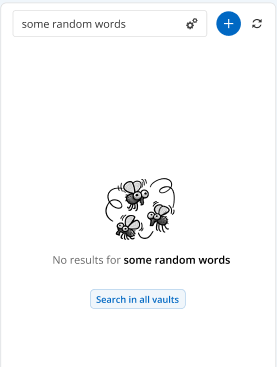
So if you can't find something with the filter, you could move to a search to all vaults. I think those changes could help user to use the right field. To conclude, I'm asking all those questions, not because it is too difficule to hide the filter bar but I want to understand how our users work and try to improve the control instead of removing it because the goal of that control is to search in one vault instead of all vaults and have lot of results. Let me know if what we suggest are good ideas.
Best regards,
François Dubois
0737cf4c-c26a-4e4b-9bb8-54b71b40fdfe.png
Yes, I like your suggestions. I think what you show in the screenshot would be a great addition where the user could be told that nothing was found in the current vault and then prompt them to search in all vaults by clicking on the button. That would definitely bridge the gap between the two bars and virtually remove frustration from a user or cause them to think they don't have permissions to a location when they do. Thanks!
Hello,
Thank you again. I'm creating a ticket in our backlog to improve how we handle the filter. I can't promise, but we will try to include that improvement in our next major release planned for June.
Please don't hesitate if you have other questions or comments.
Best regards,
François Dubois
Hello,
For your information, version 2024.2 has been released recently, and we have improved the vault filter. Please try it and let us know if it works for you.
Best regards,
François Dubois
Good Morning Francois,
We're now on 2024.3.4, previously upgrading to 2024.2.10 in September. I wanted to let you know that it seems our users are still confusing the filter bar with the global search bar. While I did notice that the text in the filter bar (prior to entering in an item to filter) has changed from saying "Filter" to "Filter by Name." However, we still get tickets from our users thinking their permissions in a vault have been lost or become broken because they treat it like a search bar. Once we educate the user, they are fine. Our issue isn't so much with the job that the filter bar does, but rather with it being present. Our personal preference would be to have a way to disable it altogether as our users don't seem to benefit from it and it just causes them confusion. It otherwise does its job as intended if you do in fact use it to filter out content to what you typed in, but the users just don't seem to gravitate towards the global search feature more. Thanks!