Please fix the UI!
Hello everyone,
today we made a brave step and updated from 2023 to 2024. I am a long time RDM user, and DVLS for about 6 months now.
One of the first things that caught my eye was the new web UI for the DVLS - and not for the better unfortunately.
I honestly think that you went from an UI that was half functional in 2023 to an UI in which you attempted to make it better, but did a wrong turn. Why:
1) in 2023 one had both user-vault and other vaults icons on the left side, which made switching between the user-vault and other vaults quite comfortable and fast; however, browsing of other vaults was tedious, because one didn't have a list like in 2024
2) in 2024, you created the list of the vaults on the left side, which is a positive addition to the UI, but now you move the user-vault to the bottom of the window? Why? Wouldn't it be much better if the User Vault was just above the list of All Vaults on the left side? Yes, I am aware I can go to the "old" look, so I have Vaults and User Vault with the Vault-dropdown, buuuut...
3) you remove the nice blue icons which everyone knew, and replace them with some tiny counterparts?
I think the UI has lots of potential to be come much better and way more functional.
Wouldn't you agree?
All Comments (6)
Hello Srdan,
Thank you very much for sharing your insights with us. Your feedback is invaluable to us, whether it reflects positive experiences or highlights areas for improvement. From what you've shared, it seems you are missing the larger icons and would prefer having the User Vault positioned at the top rather than its current placement at the bottom.
Altering an established product can be challenging, especially when considering the diverse needs and scenarios of our client base. The decision to position the User Vault at the bottom was made with mixed advantages in mind, recognizing that it might not align perfectly with everyone's preferences, including yours. I apologize for any inconvenience or frustration this may have caused you.
To address concerns like yours, we're excited to inform you that plans are underway to enhance user customization. We are improving the concept of Favorite Vaults, it will be renamed "Pinned Vaults" and be placed prominently at the top. This update will include the option to pin the User Vault, thereby granting you the flexibility to organize your most frequently accessed vaults according to your preference.
I'm eager to hear your thoughts on this proposed solution. Thank you once again for your invaluable feedback.
Hello Simon,
you correctly summarized my post indeed, I just tried to explain it in detail. These are however two main complaints I have about the new UI, which both describe two very important issues: useability and visualization. I am very eager to see how my users react today.
The idea of the pinned vaults sounds like a good one. In my opinion, it's important to think about the aforementioned issues and just see that user needs least possible clicks or moving to move around in a daily business. I believe having multiple vaults including a user one is nothing that only we use, so concentrating on this area should be your priority in my opinion.
Hello Srdan,
I hope this message finds you well. Have you received any feedback from your users? If so, could you please share it with us?
Also, could you send a screenshot of your DVLS via a private message? This will ensure I properly understand your use case.
Thank you!
Well, yes, with mixed results, as expected. But one of the main recommendations was what I already suggested: a compact list with all vaults, including user, in a same space. The goal is to reduce the need for too much mouse movement. Currently some of my colleagues simply open two tabs in the browser, as we usually only use 2-3 vaults per user.
No need for PM. Here you can see what I suggest, either put the User Vault before or after Sessions, simply using the separator line. I would say top is the most appropriate place, just before the rest of the sessions. As far as Favorites, they can remain on the bottom, however, even when using Favorites, the User Vault should remain at the top. Additionally, one can put an option in the settings to hide the User Vault, in case a user doesn't use it.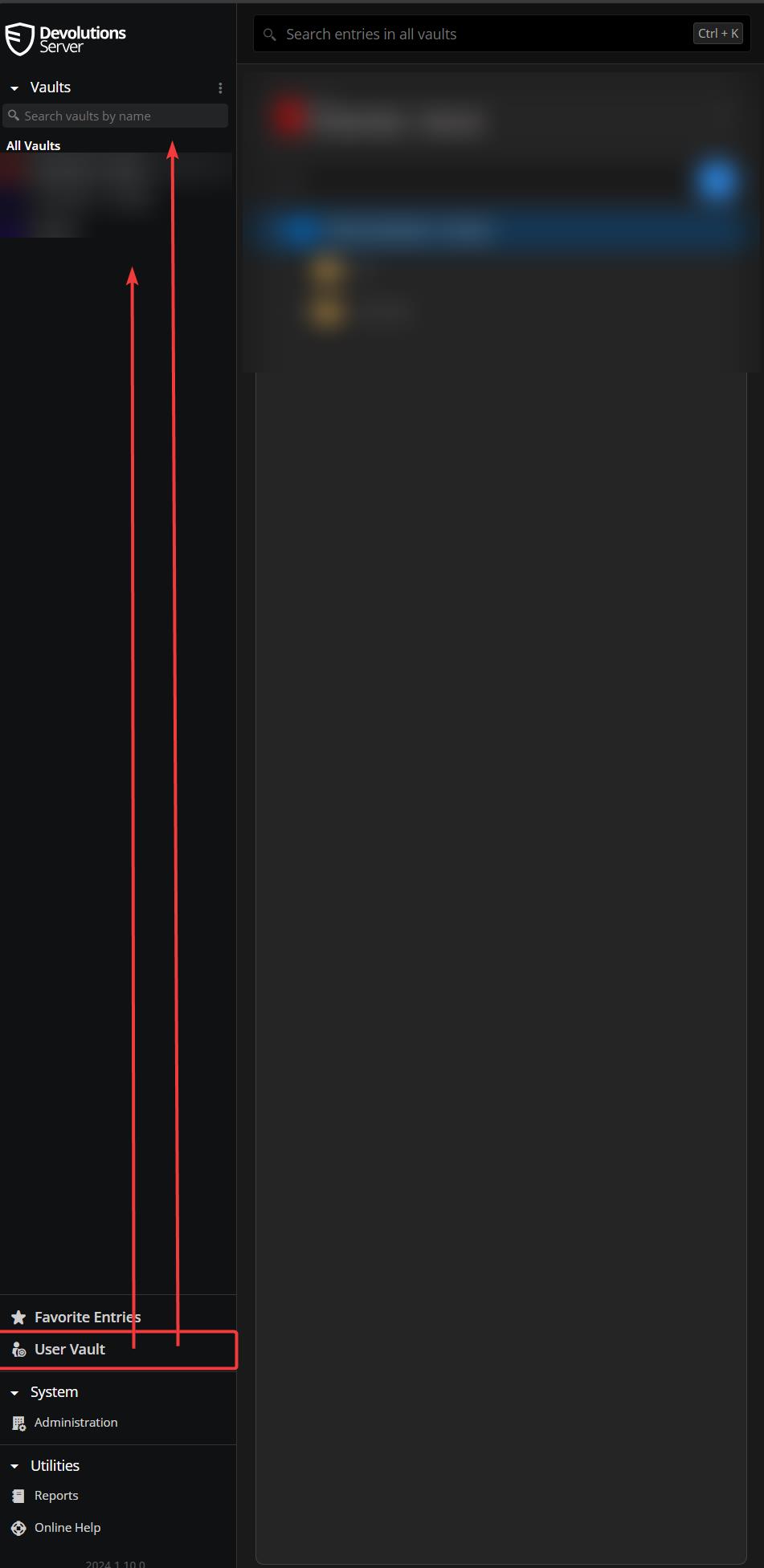
dvls.jpg
Here is a new issue:
Business User does not contain entrytpy Username/Password any more (need to set IT Professional).
This is more or less informational only for anyone else out there, I created the ticket already.
Hi Srdan, thanks for the feedback. We'll keep this in mind in our upcoming changes.
Also, thanks for bringing up the issue and opening the ticket about Business User. If there's any further information you'd like to share about your experience with the updated UI, please do not hesitate to reach out.
Thanks