UX feedback

Hello
I've received some feedback from our RDM users. Since only one team was wiling to spend time to write it down, and they are Linux users, I'm posting it on the Linux forum, but most elements also apply to the Windows version in my opinion.
Below you can find the feedback I received, if there are further questions, please let me know.
Some suggestions concerning UX
improvements for RDM (in order of highest priority to lowest priority):
Immediate user input feedback:
Mostly, this comes down to adding loading states: users have no patience, when an app does not give user feedback within 300ms, they think the application might be crashing or bugging. Give the user more information as soon as possible after a user interaction about what is going on. Hint; it might be insecure to give the "real details" when loading, so the feedback provided to the user does not even have to be the truth, as long as the user gets the impression the application is "very busy" & something is moving on the screen. Also don't go too technical (don't make the user feel dumb), simple techincal words are OK, for example: 'connecting to server...', 'loading passwords...', 'decrypting files...' => with some small animation, if something is moving on screen, users are more convinced the application is not crashing.
Remember, users can have very slow machines or networks, try to simulate this when testing the application manually.
More prominent searching possibility, as a database with passwords grows, the way the passwords are logically organized is an individual thought. For example, 1 user creates a folder of passwords called "Internal Apps", for other users it will never be clear as to what is in this folder. This is not something software developers can anticipate or change. So the solution is to have an easy, prominent & reactive search feature. Right now this feature is shown fairly small, in the bottom left corner, which is OK for Eastern users (writing right-to-left, top-to-bottom). But Western users (US / Europe), (who write left-to-right, top-to-bottom) it makes more sense to put prominent features in the top right corner. And make it big & prominent enough, this is the number 1 used feature of RDM.
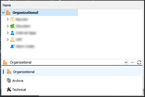
Also this search should be a global search by default. A search in the entire database, not just in the currently selected category, this is unexpected behaviour & very frustrating to users. See screenshot for example, user A is searching for a password in the "Technical" category, so (s)he starts typing in the search input, but does not find it because only "Organizational" is shown. (There actually is no need for these categories, since the passwords are stored in a tree-like structure anyway.
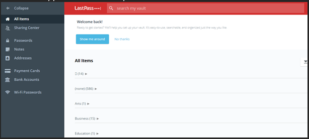
Hint: "steal with pride", don't invent the hot water again, check how existing password managers work (try to look at software that has a big budget for UX, Google, Apple,...). Take "Lastpass" for example, notice the very prominent "search my vault":
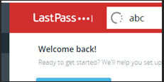
While typing in this search input, notice the loading indicator (immediate user input feedback):
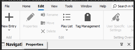
Give information concerning why a button or a feature is disabled, see screenshot below, when hovering the cursor above the disabled "Properties" button, an info-popup labelled "Properties" is shown... That is to no help for users (except when the button consists of only an icon off course). For disabled buttons, explain why the button is disabled. For example in the screenshot below I am hovering "Properties", the info "Please select a password to edit its properties":
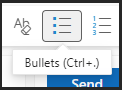
Also, this info title is the place to show the shortcut for this button, example from Office 365:
Not convinced? Gather analytics ofthe behaviour of users (respecting GDPR off course, users have to know this, but do keep the info anonymous), save the amount of clicks on all buttons, save the amount of characters typed in before a user clicks (finds) a password,...
You will learn A LOT by looking at these numbers.
When in doubt, A / B testing will bring the answer to what UI to choose. For example, place the search input on top right for 50% of the users (randomly), and not for the other 50% of the users. Then gather data concerning the usage of the search input, this way numbers will tell you what is the best place for the search input.
I hope this information is helpful and can be used to improve the UX of RDM.
We are happy to help.
With kind regards,
Nick
P.S. I'm just the messenger 😉